It seems that FLX now has too powerful an effect in the SIO → SI recipe - it gives a speed up of 40%, and is faster than the AL based one. I suggest making the C + O + FLX based recipe 20% slower than the AL one, and then the C + O recipe 20% slower again. Otherwise it seems unlikely that anybody will bother with the AL based recipe any more, given that C + O + FLX is usually cheaper than AL.
… except that they’re still getting “free” AL from the BER → BE recipe. I suggest that should be changed to produce ALO as a byproduct instead of AL, just as SI was changed to SIO. Otherwise players can immediately use the AL + SIO to create SI without needing to import C + O at all.
Your observations are correct. I considered “equalizing” the recipes as you suggested, but then I thought it might actually be more interesting and create more intriguing tradeoffs if they’re different. Might require more balance tweaks in the future of course, but I’d like to see how it plays out.
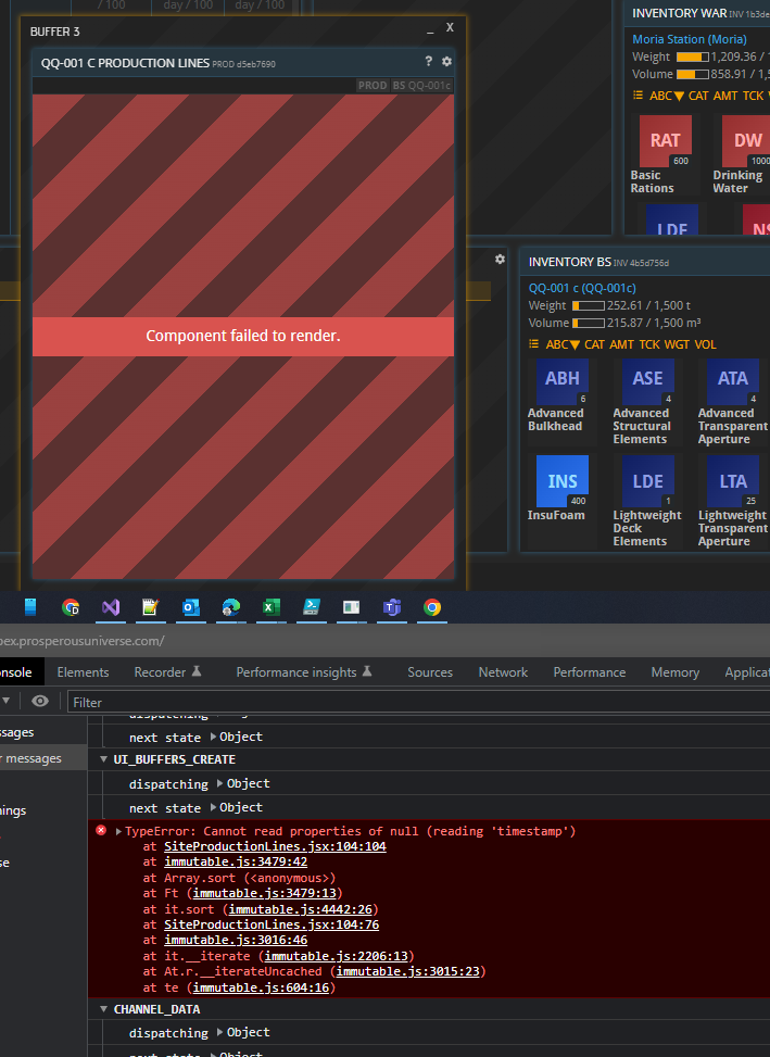
Found a bug. When I have a production line without workers, and I’ve created some production orders then there’s null exception (probably introduced with the sorting functionality)
I’m not a fan of how spreads have been implemented. If the current high bid is 1200.00 and I put in 1200.01 it rounds down to 1200.00, which means I have to manually figure out how to beat the high bid rather than having it calculate it automatically for me. That makes it way harder to trade. Bids should automatically round up, and asks should automatically round down.
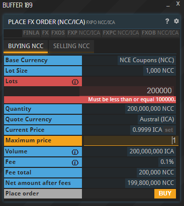
The 1000 lot limit in the fx market got raised. You forgot to include this in the patch notes!
Considering how the tick sizes will impact the marketmaker arbitrage and make those slightly more costly, this change couldn’t come at a better time for players exchanging large quantities of money. Or, like my plans will eventually be, to park large quantities of money and make the market.
One issue comes to mind though: Right now the user decides as the very last step if the order they are typing in will become an ask or a bid. So in order to display the effective price before sending the order we cannot automatically round up or down, because we don’t know if its going to be an ask or bid.
We discussed it a bit further and agree we shouldn’t implicitly round prices. What we could imagine though is splitting the “bid” and “ask” into 2 seperate lines and giving each one 2 buttons, one to set to the price as it’s written, and one to “front” the order book, i.e. go to the next-higher tick for bids and the next-lower for asks. This would satisfy the use case brought up by @Anduin (which I think is not an uncommon one) without getting rid of existing functionalities.
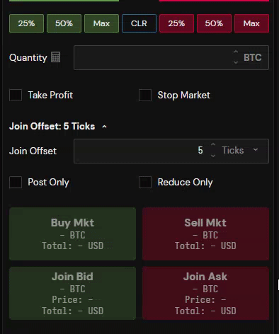
It seems the current buy/sell UI is not well suited to having ticks. Currently the UI shows everything relevant to both BUY and SELL at the same time, which leads to a confusing buffer, in my opinion. And now there will be additional lines and buttons? That will just make it worse.
The main issue seems to be that the buy/sell distinction isn’t made until the final step. Whereas in the player’s mind the question of buy or sell is the first thing they know. So ideally the UI could be changed to have BUY and SELL buttons near the top of the buffer, and then the rest of the UI changes to show suitable “list at next tick”, “list at current tick” type shortcuts, depending on whether the player is buying or selling.
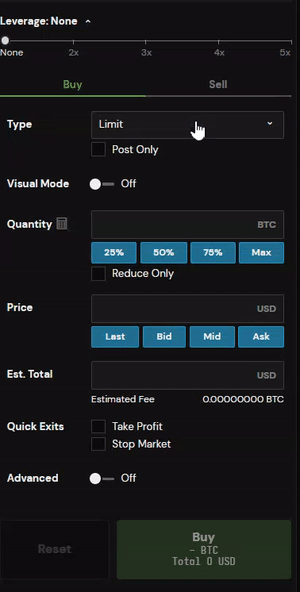
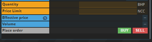
It looks like the FX buy/sell buffer works on this principle already, from the screenshot above. So maybe this would be a relatively easy change for the CX too.
This is an endless debate in the world of UI\UX design for trading.
I have been spearheading as much as I can against order entry systems which use “pages”.
The problem with seperate buy\sell pages is you are constantly going back and forth between them. And you WILL fat-finger and use the wrong one. You will buy when you mean to sell. Having both buttons color-coded on the same page, which is how PRUN is setup, reduces this happening by at least an order of magnitude. I don’t think I’ve executed this kind of fat finger in PRUN, ever. Because the system is designed in a way which prevents it.
The other implementation is where everything is integrated into one form, which is how APEX has been designed.
(P.S I was part of the team which worked on building this interface)
Now, I don’t think the correct answer here in PRUN is for unbounded market orders. I think everything should be limit orders. But perhaps this gives some better layout of how it’s done, at least within the crypto sphere.
One common trick which is done is you can click on the orderbook, and it autofills THAT price to your order entry. With dozens of price levels on the orderbook it gives you a lot of control for autofilling the price you want to enter for a variety of reasons. This doesn’t apply much to PRUN here due to sparse order books, but also because that buffer is seperate from the order entry buffer.
My point is - if we want to have the ability to click something and have autofilled prices, at all, they need to be part of the CXPO buffer. Broadly implemented as they are now. I think the implementation is pretty good.
And finally - I don’t think 2 seperate lines and 2 seperate buttons, for a total of 4 is the correct answer. Upon more reflection, the feature we’re talking about “best bid” is post-only. Kind of. It puts you at the front of the orderbook but also prevents you from matching. There are other order types which put you directly underneath the best ask. I’m not sure what the right answer here is or how to implement an automated button that hits the “best bid”. Who knows if that bid is even one you should be frontrunning? Now that I have more time to reflect, this may create the wrong incentives to people to always use that button to be first in line… when there was only one small player selling 10DW and there was no need.
I actually don’t know the right answer here. There is merit about including too much information, aka these 4 buttons. Perhaps we could remove the “price average” line as a compromise? Does anyone use that?
In addition to the description I gave above for the fat-finger risk, what do you gain out of this change? You add another step, another button that must be clicked for every single trade. To make an interface less cluttered? This is not a good tradeoff to be made. It’s two functionality negatives for a aesthetic positive.
I’m not a fan with how the FX buffer works. Flipping back and forth, and doing so resets the form. What if I want to place 4x orders, all of the same quantity, but at different buy and sell prices? 2 buys and 2 sells, making a fx market for other people. I now have to manually input all the information again when I flip from buy to sell. Whereas with one form, that’s not necessary. All you need to change is the price.
I don’t necessarily disagree with the princples of what you’re saying, but…
Given that players have to open a new instance of the buffer for each material that they are trading, I don’t think anyone will be switching back and forth between buying and selling much. I don’t have any data on this, but I expect that players who “make markets” by posting buys and sells on the same item are a small minority.
Also, there’s nothing to say that the values couldn’t remain in the fields when you switch from buy to sell mode anyway - it’s just the default button actions for things like “place at next tick” and “trade at market price” that would change.
The gain is that the trading UI becomes easier to understand and use. Also, if the buy and sell screens were separate, then the button you click on to get to that screen could already put you into buy or sell mode. i.e. currently you click on TRADE to open the trading screen, and then BUY or SELL to place the order. With the change, you would click on BUY or SELL to open the trading screen, and then PLACE to place the order. It’s still two clicks.
Except that as you pointed out, to make it extra clear, the PLACE button should also be called BUY or SELL, and have an appropriate colour, depending on which view you’re in, to avoid confusion.
If we’re sticking with a single view, then I do actually like the second screenshot you showed above, with two columns of buttons, BUY on the left, and SELL on the right. Maybe the auto-fill buttons in PrUn could be like that.
I mean… green & red buy & sell buttons are pretty self explanatory.
In all the new player help I’ve ever seen there are like no questions about how someone should use CXPC. It’s pretty straightforward. Beyond my dislike for seperate pages, I just don’t see the aesthetic or functionality gain we’d get by separating the two pages.
& many people may not go back & forth posting both types of orders, but you are adding another click for people selling something since the default is the buy page.
The gain here is we’re removing the clutter from extra “set” buttons? I suppose. But the matrix I posted above is a great way to solve that - if a bit advanced for new players.
I’ve found some minor changes not mentioned in the update notes I wanted to mention here to check if they were all intentional:
Bulk production orders now show in notifications as the entire amount, i.e. 100 x 10 RAT now shows “1000 RAT produced”. Loving this feature
Buffers hidden partially behind other buffer no longer come to front when selected (except on the topmost border). Minor inconvenience only, hopefully just a slight bug thats easy to fix.
When repairing buildings, the repaired building no longer moves to the bottom of the list - now you have to scroll down rather than spam clicking the same one to bulk repair buildings, which makes it far worse for repairing large bases (like FP/RIG bases, especially for anyone with a 1k area base of those).
EDIT: I’ve since found that the repaired buildings just move to the top of the list now, rather than the bottom - so this is no longer an issue, though still worth a mention so that people know it has changed.
Overall I’m liking the update, but haven’t seen any of these mentioned anywhere yet so thought I should bring them up to see whether they can/should be fixed. Thanks!