Release Notes - Mobile UI

Release date

The Mobile UI release will be released no earlier than Tuesday November 2nd 2021.

General Notes

If your APEX console is stuck in a loading state after the update, please make sure to refresh it once after the update to ensure you have the latest version.

Overview

The Mobile UI is a companion to the existing desktop version of APEX. You can reach it by simply pointing your mobile browser to the APEX website. It is not meant to replace the desktop version, but rather allow to manage your company on the go.

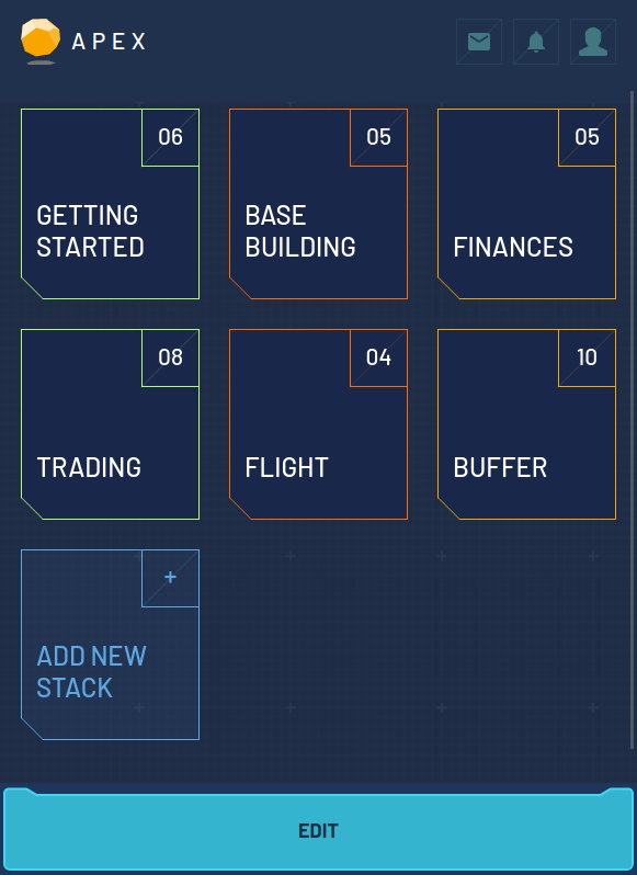
Once you open APEX in your mobile browser you will see a list of initial stacks. A stack is similar to a screen of the desktop and holds a list of cards. Similar to tiles in the desktop version, a card represents a command.

In the screenshot above you can see the cards in the “Getting Started” stack. The footer at the bottom has some useful actions:

  • “Stacks” will bring you back to the list of stacks, as does clicking the APEX logo by the way!
  • “Back” works like the back button of your browser
  • “Edit” allows for the removal of cards
  • “Add new command” allows for a new command card to be added at the end of the stack.

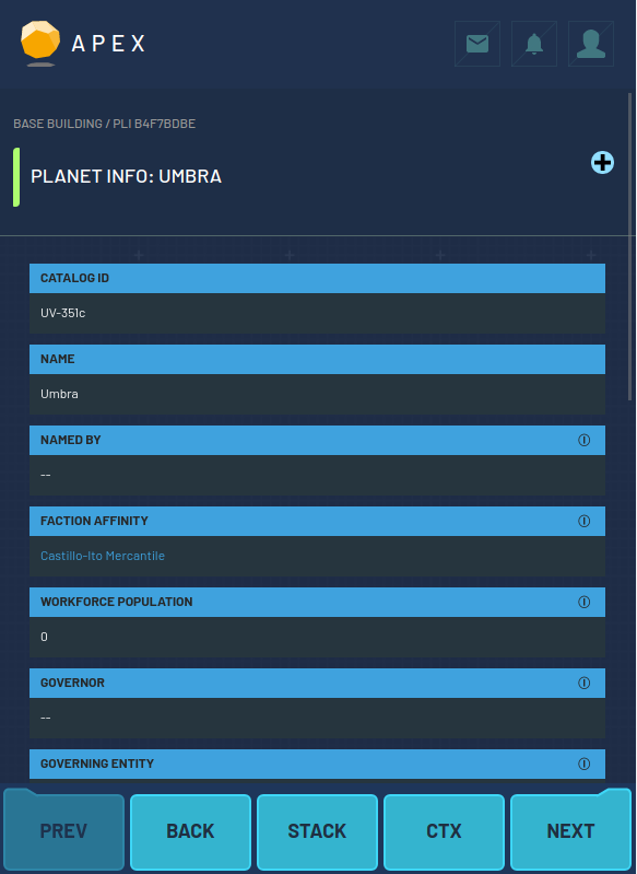
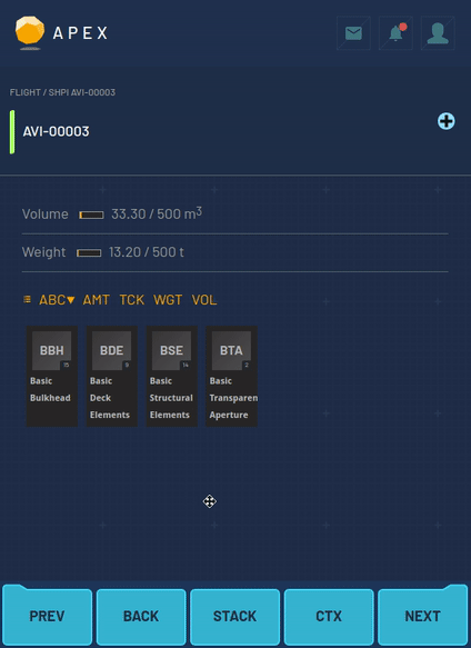
In the screenshot above I opened a PLI card in the “Base Building” stack. Similar to the desktop version, you can see all the planet’s details. The footer now shows different buttons:

  • “Prev” and “Next” allows the user to go to the next and previous card in this stack.
  • “Back” works like the browser’s back button
  • “Stack” will go back to the stack’s list of cards
  • “CTX” shows a list of context actions that are available for this command. This list is dynamic and will be different for each command.

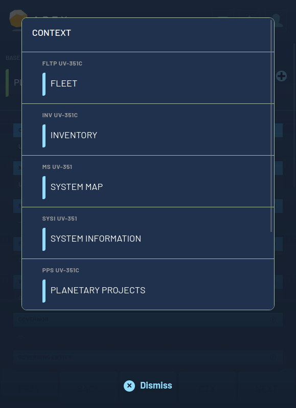
This is what the context actions for the previously shown command look like. Clicking one of the commands will open it in “buffer mode”, e.g. the command will show, but is not part of a stack yet. You can use this mechanic to traverse from command to command to look around and gather information. Let’s click on “Fleet” for example:

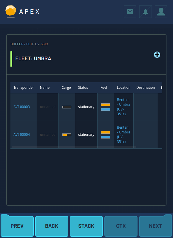
The fleet command opens and the background turns darker to indicate that this card is not part of a regular stack. The round blue + button in the header of the card allows this card to be added to an existing, regular stack.

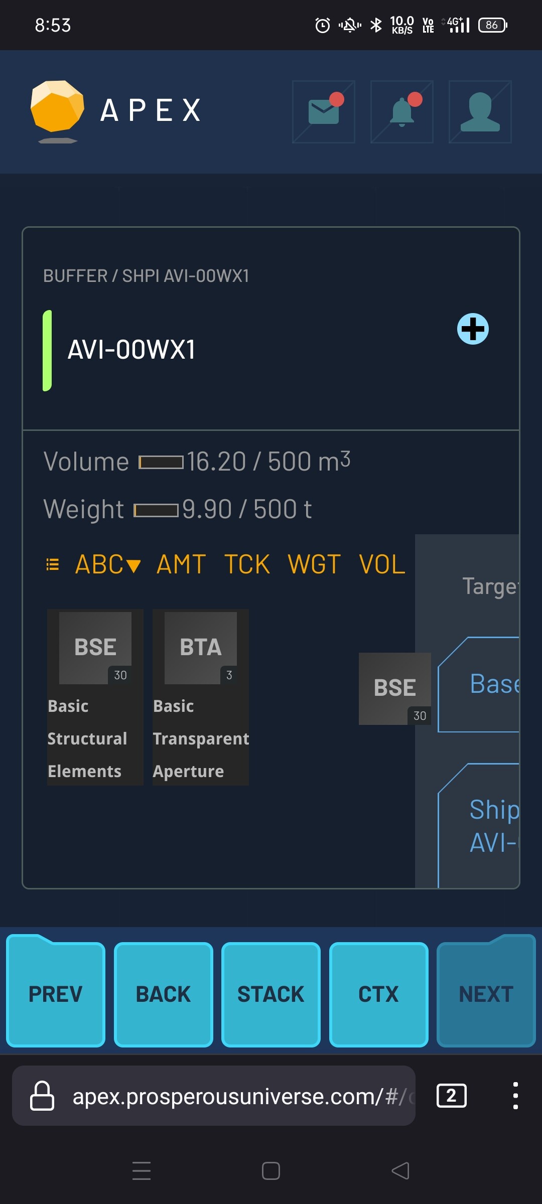
All commands that are being opened in “buffered mode” will automatically be added to a stack called “Buffer”. This is the reason why the “Prev” and “Next” actions are available as well. This time they allow for scrolling through all cards of the “Buffer” stack. Pressing “Stack” in this case will lead us to the buffer stack:

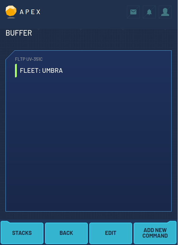
Right now this stack only contains one card. Finally lets go back to the stack overview by clicking the APEX logo:

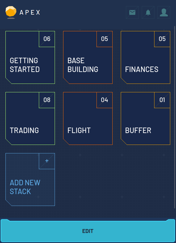
As you can see the buffer stack is shown at the bottom right and contains one card.

Since inventory transfer was a hassle on mobile so far, we introduce a completely new way to transfer items from one store to another. Once you start dragging an item, a list of target stores appears and dropping the item onto one of these opens a new item transfer window:

20211029-inventory

Known issues

The mobile UI has some known issues that we want to share here, so you don’t have to resubmit any bug reports:

  • Company Registration Company registration has been deactivated and is only possible via the desktop version
  • Maps Universe, system and surface maps don’t work properly, so we disabled them. The maps will be added as soon as the new (desktop) maps have been finished
  • Chat There is only very limited space for showing chat messages, especially when a on-screen keyboard is active. This will receive a redesign in the future.
  • Buffer stack The buffer stack holds all commands that are not part of a regular stack, similar to the buffer windows in the desktop version. The commands in this stack are persistent and are not cleared after a reload. We will automatically remove commands from this stack in the future, so you don’t have to manually remove them.
  • Layouts To reduce the development time, we tried to re-use as many commands from the desktop version as possible. In some cases, we changed the command design slightly. Please let us know which commands do not work well on mobile so we can consider a redesign for the mobile version.
  • Arranging stacks and cards Stacks and cards can not be re-arranged yet. We will provide that functionality in the future.
13 Likes

Thanks a lot @molp & team!
Looks very clear. It took me a moment to get into it. But nice, a milestone is done. Great job!

1 Like

Hello. I mainly play on an iPad using Safari, and I set up my screens so that I could play using the desktop interface. I am now being forced into the mobile site on the iPad. Is there a way for me to get the desktop version? (According to Safari, I am requesting the desktop version.)

(Update - I tried Chrome and Firefox on iPad, and they did not work at all.)

1 Like

Absolutely awesome, something I’ve been wanting for ages. Thank you so much.

1 Like

This is great! Thank you!

Do you want us to submit bugs as we find them as replies here, the main Bug thread, or a separate one for UI?

1 Like

Thank you! I guess it makes sense to post the first bugs you encounter in this topic. I already fixed a few things and will release the fixes later today.

Thanks for the feedback, we’ll discuss that in the team meeting.

I am curious, how many other players have actually been playing the game via a mobile device as their main one?

Some bugs I have found so far:

  • Can’t scroll through inventory. Fixed
  • Can’t see all target store options when moving inventory. (could be related to the scrolling bug edit was not fixed with the scrolling bug fix)
  • Can’t see all notifications Fixed
  • When using the sliders for Fuel and Reactor usage, sliding to the left also triggers the left scroll functionality of the grid that the sliders are contained in. This prevents you from moving the slider more than one notch at a time when sliding it to the left. This can be applied to sliding through charts as well.
  • When deleting command cards, you get an invalid card screen. If you hit back though then it shows that the card has been removed.

Some look and feel recommendations:

  • Currently you can only trigger commands in stacks by tapping the text in the command card, but not by tapping the card itself. Extending the trigger event to the entire card itself would prevent people from having to either use two fingers or overextend their thumbs when the command text is short in order to open the command. Fixed
  • When posting an ad on a LM, it’s really easy to accidentally hit the max Deliver and Duration times while swiping up or down. If one is not paying attention they could inadvertently pay a higher fee than they were expecting or have a contract with a much longer delivery time than they would like. I don’t have a very good suggestion for this other than increasing the size of the scroll icon so that it is more in line with the natural placement of someone’s thumb when swiping up or down.
  • I don’t know if this functionality can be turned off through the application, but on Chrome on my Android device, if I swipe down on an area that doesn’t have a scroll bar or I’m already at the top of an area that does, then it triggers my browser to refresh. This could cause some frustrations when trying to post ads to the LM or trades on a CX.

This is what I have found so far. If I stumble across anything else, I’ll post them here.

1 Like

I play interchangeably between a mobile device and a laptop. I can access the standard version if I go into my chrome menu on my android phone and select “Desktop site”. I don’t know if that is an option on Apple devices though.

To give a bit of background on my “ipad desktop” setup.

The main issue with the desktop version on the ipad was that I could not control buffer locations, which made item transfers hard. My workaround was to build a lot of screens (14 that I use), most of which had location information in tiles (production, market prices) along with inventory tiles for ships and base/warehouses so that I could drag goods. This way I had all the information I needed, along with the inventories that I would control.

It takes time to build all those screens, so a new user would have more difficulties.

From my perspective, having the equivalent of two tiles on the ipad mobile interface would probably meet my needs. A phone screen could not support that, but the iPad screen has enough room to run two “tiles.”

Use cases.

  • I like having my inventory open along with the market screen so that when I have a variety of things to sell, I can look at my inventory to see what is next.

  • If I have my production screen open, I can see how much of a good is being used as an input to another process, and so how much is safe to transfer out.

  • FX is difficult to follow without seeing the two order books for a currency pair.

  • Easier to spot trading opportunities if you have two CX screens open at the same time.

1 Like

As promised, fixing the first issues:

  • Allow clicking anywhere on a card preview to open it
  • Fix environment table in PLI
  • Fix scrolling issues in NOTS and INV panels
  • Fix opening contracts from the sidebar and from inventory items

You will need to refresh the page to make it work.

1 Like

I found a new bug. When deleting command cards, you get an invalid card screen. If you hit back though then it shows that the card has been removed. I wonder if it is related to the change for the entire card being clickable now. Maybe when the delete button is pressed, the card is getting pressed at the same time, so the ui tries to go to the command after it’s been removed.

Clicking anywhere on a card definitely makes the UI flow better though, thank you for making the change!

On Firefox for Android 11, the drag interface for moving from ship to base gets cut off. It’s perfectly usable but I figure I’d raise it.

1 Like

Will give it more time and write some full comments later as I currently use mobile for 99% of play.

But my current thinking:

Its way too information sparse.

Everything is too big, you can only see one thing at a time, and when it doesn’t seem easy to flick between buffers this is a real drag. My phone could comfortably fit 4-6 buffers on it. If I could have multiple buffers and able to ‘lock’ some on as my SCRNs that would be great.

I do love the moving system though!

While away from the desktop (work, going out etc.) I have been playing on mobile a fair bit. Sure you have to scroll around the screen, but for fulfilling ads and requests as soon as a Discord message is sent, it can’t be beat. I have used Puffin browser for the mouse ability on a touch screen, but the vast majority of time away from a desktop I’m not moving stacks so could use any browser.
I’ve had a quick look at the mobile UI and I really should look more carefully. Having said that my first impressions are the same as Bobemor: too little information on a screen, too much screen real estate wasted, too cumbersome to get from one screen/buffer to the next.

1 Like

Yep, that’s it, thanks!

Thanks! That interface is a bit tricky, we’ll need to add another round of polish to it.

I agree with you two. If you have been using the desktop version on mobile it can feel like a step back. The goal of the mobile UI is to allow to get things done, even on the tiniest mobile device screen. Generally I do see some options to improve the situation for players like you:

  • Implement a toggle to switch between mobile and desktop mode
  • Allow a second (third? forth?) stack on mobile devices that have enough screen estate
1 Like

Could another option be to add Pinch and Stretch functionality in order to resize the elements on the screen? Perhaps in conjunction with allowing more than one stack?

1 Like