Been playing a bit more and now i’ve started to get some stacks in place it’s doing quite well and I definitely see the potential. I’m glad that it is somewhat of a redesign to try and lean into mobile strengths and not just a compatibility port. Lot of potential!
But regarding the information density, this is a screenshot of my previous mobile set-up.
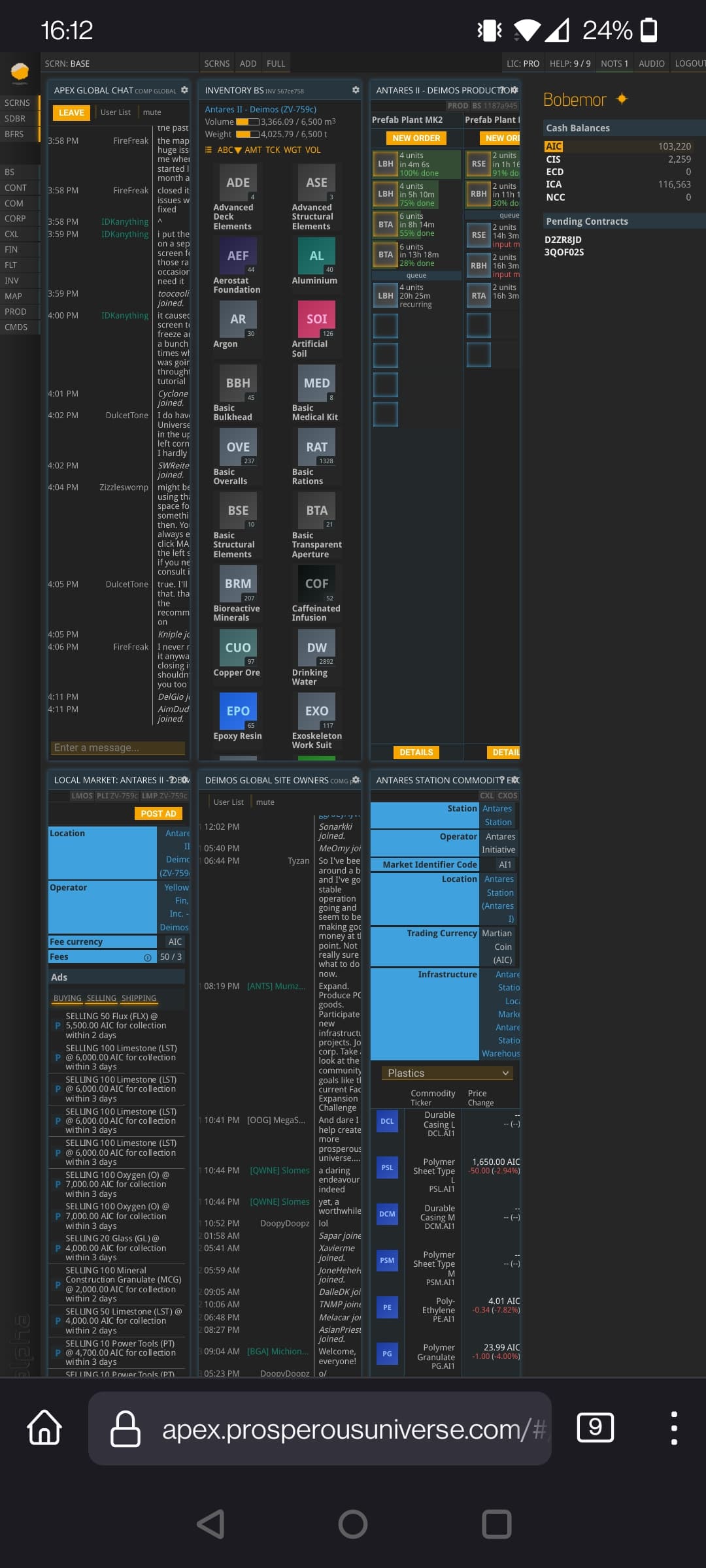
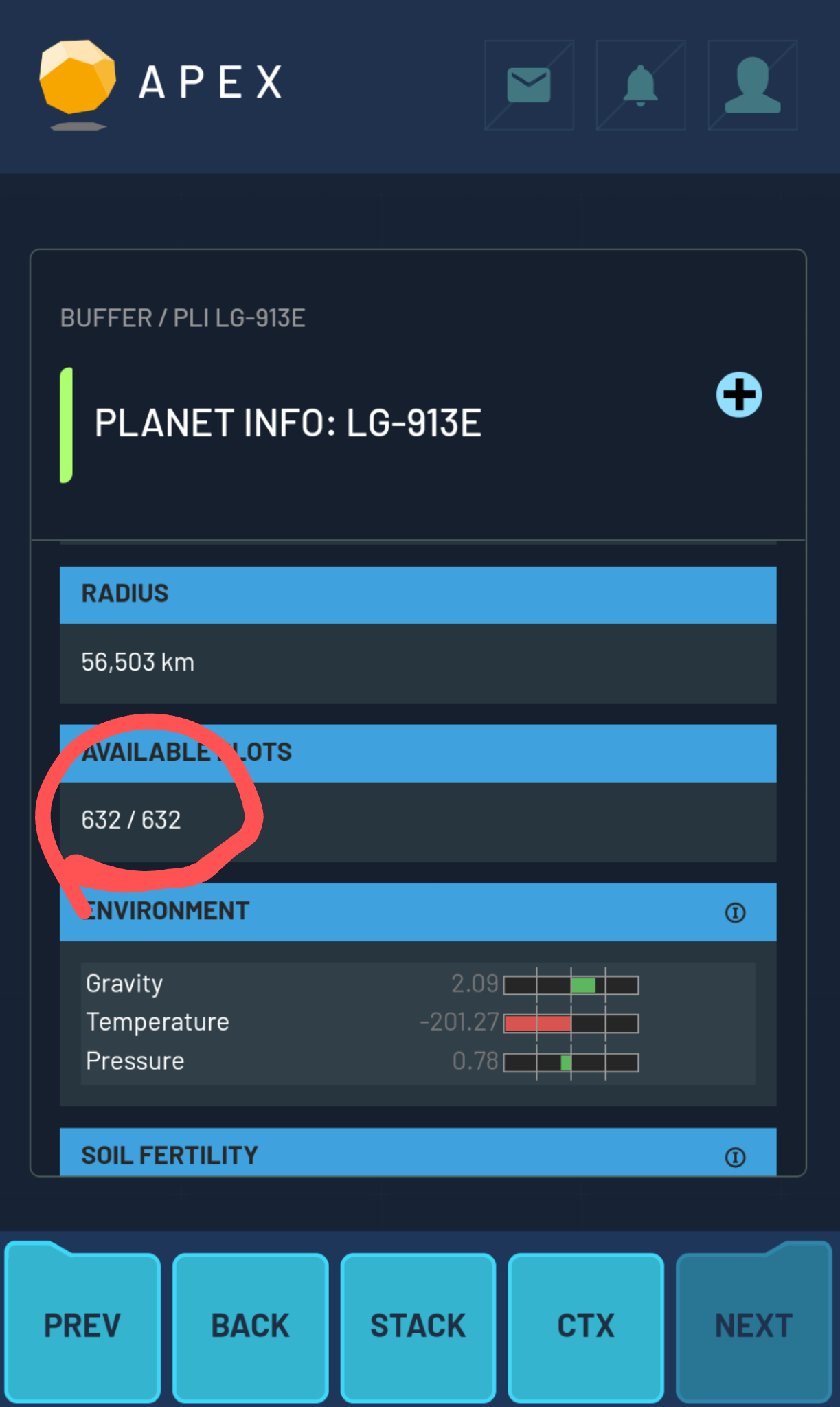
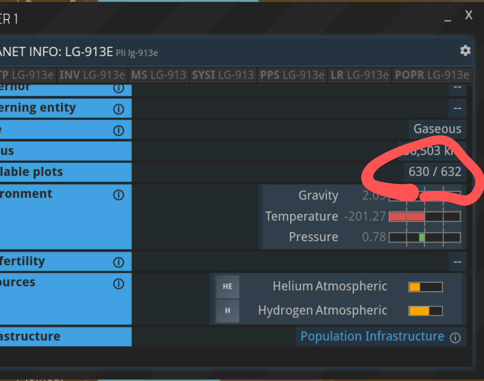
I normally would ‘play’ slightly more zoomed in and with the SDBR shut if I’m not actively doing contracts, which makes everything fit quite well. Need to scroll the production lines a bit but that’s pretty good. I do need to zoom in to press the button to say check the other CXs. But zooming in and out is pretty easy and standard for mobile.
Then we have this:
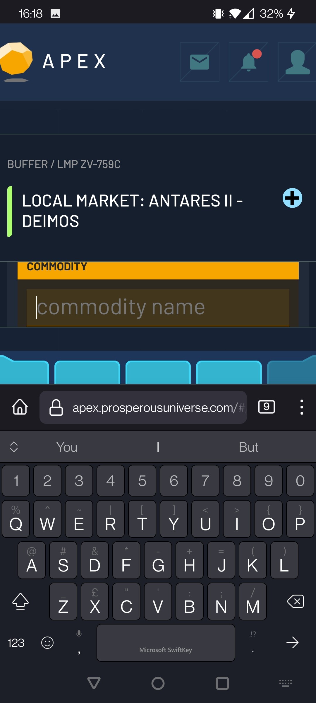
I’ve maybe been a bit obtuse with my screenshot selection, but when trying to make an ad that’s how it looks. To some extent the desktop version does lose half the screen when i need it but on the mobile version still a huge chunk of screen ‘real estate’ is taken up by the top bar, half of the bottom bar, and the name of the buffer. I do probably have what’s considered a large phone, it is a modern smart phone, but if I’m struggling for space I can’t imagine what people on older smart phones are thinking!
This then leads to actually not having very much on screen at all. Which is a real annoyance when things need you to flick through multiple buffers.
For instance when adjusting production lines, this occurs typically on about 3 Buffers. The PROD, the PRODCO, and PRODQ. That’s also a CO and Q for each separate production building, which means that to adjust production lines you could well be looking at 10+ buffers. For a small base I’m sure a stack could be set-up to flick between them, but flicking between 10 different buffers even in a custom stack for precisely that isn’t very easy. I’m not sure having a Back and Prev button is that clear as to what which one does. One moves you back a buffer in the stack, but the other moves you to the previous buffer you were on? So if you’re regularly wanting to go back to say the Prod but that’s several PRODCOs and PRODQs behind you would be best to go out into the stack menu, but when stacks get quite full that’s not always the easiest and then once you’ve done that back and prev get more confusing.
Browsing for sales between CXs would be even worse, especially if you couldn’t prepare a stack and you’re just relying on the Buffer dumping ground stack!
In short:
- There’s only a small amount of information on your screen,
- you can only have one buffer on at a time,
- you have to jump between buffers a lot therefore,
- it’s not easy to navigate between buffers as it’s not quick or clear
I think there’s definitely some small tweaks that could improve this, and some larger ones such as maybe having two buffers top and bottom half of the screen, or maybe more scrollable. I think embracing options for zooming in and out and flicking would also be quite good.
I do think it’s a good start though and i do love the inventory movement (I’m sure desktop people will want the moving features soon!)