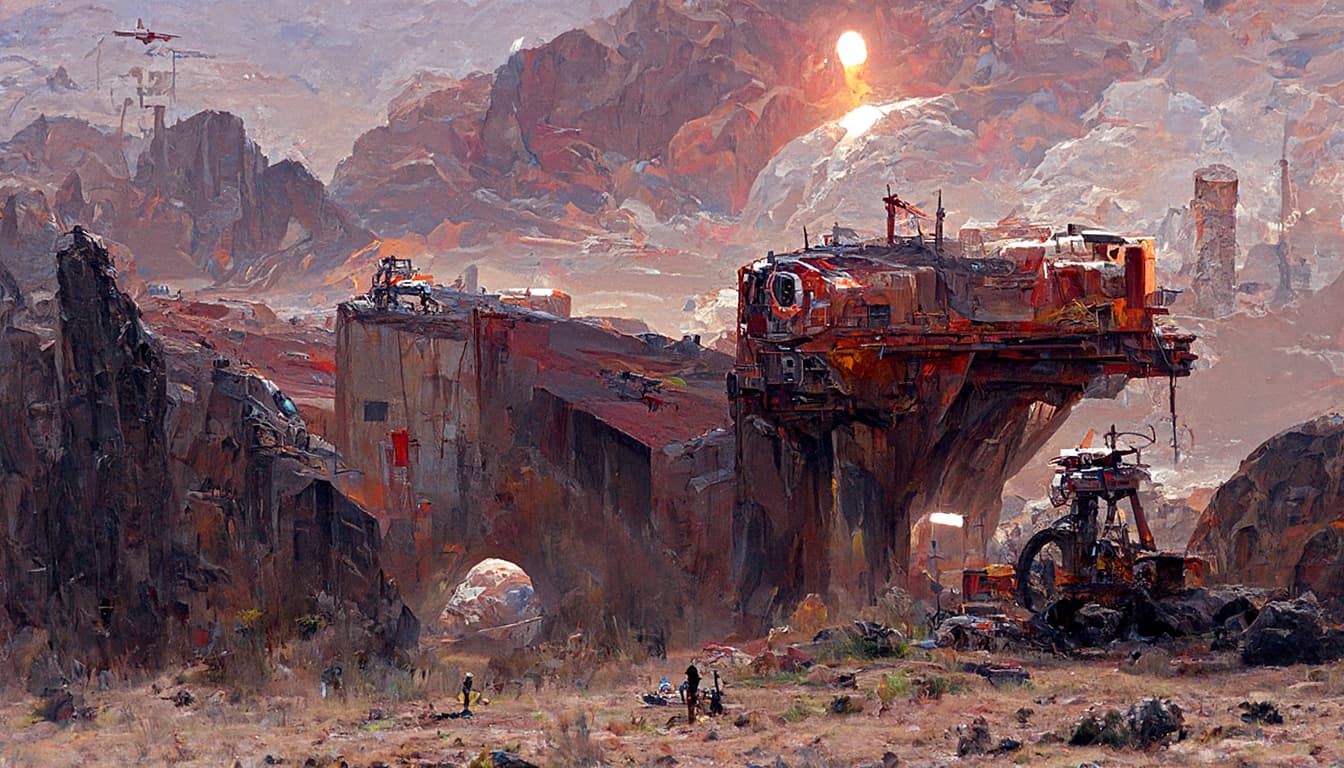
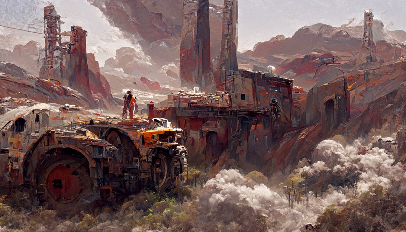
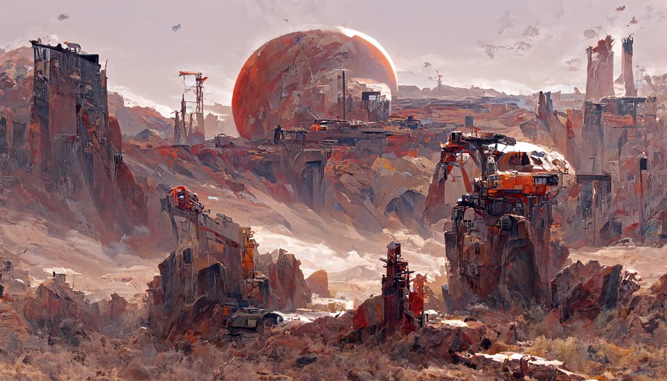
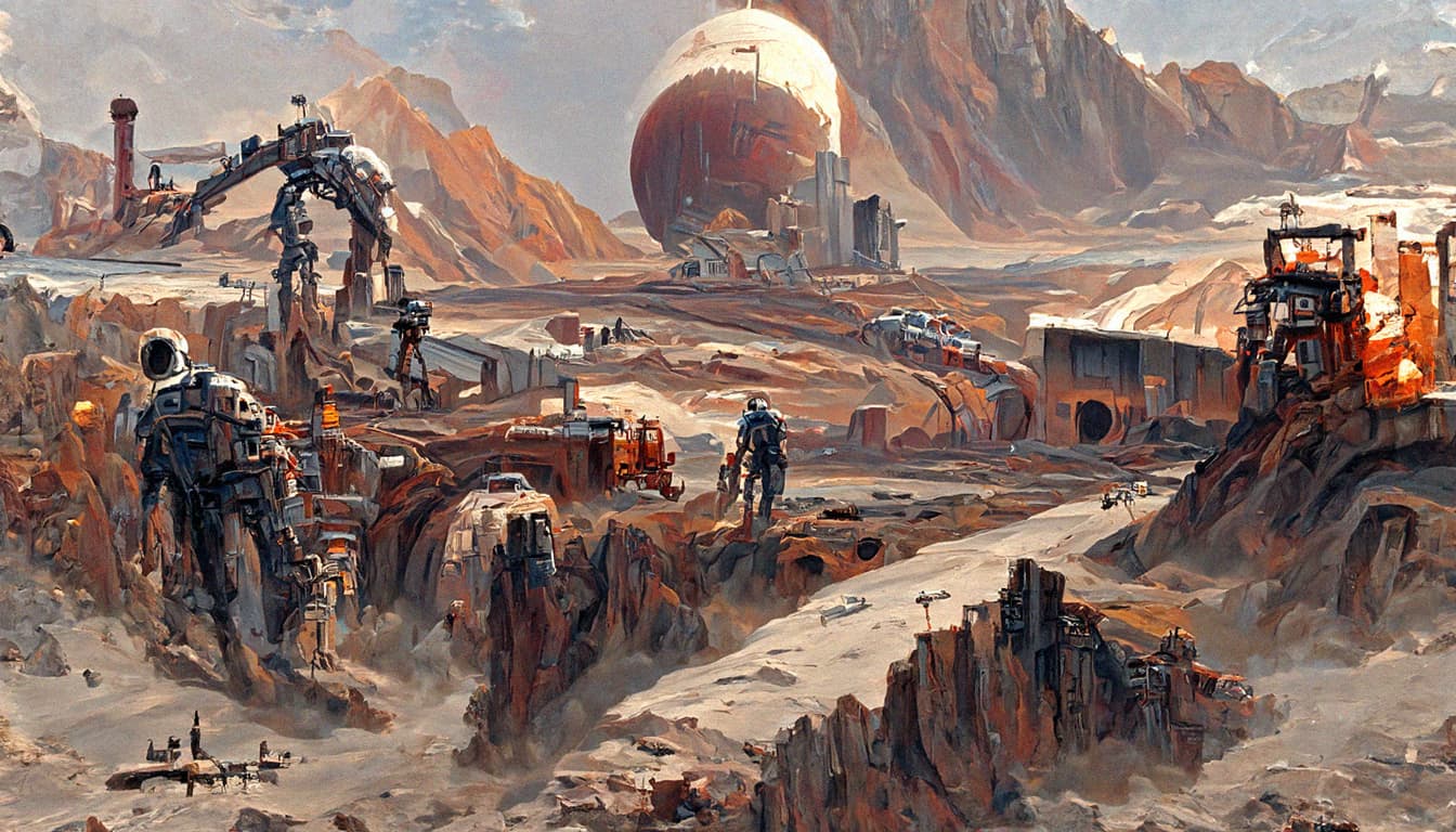
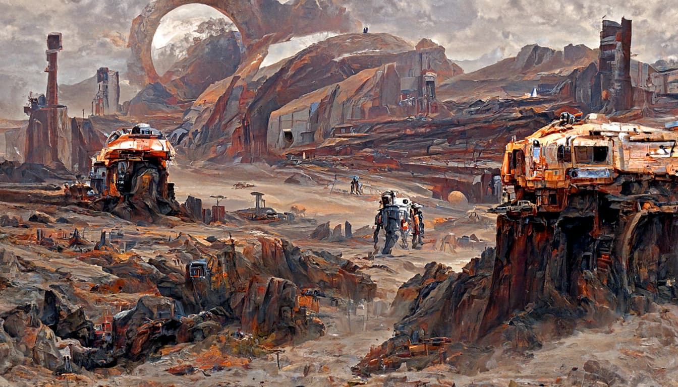
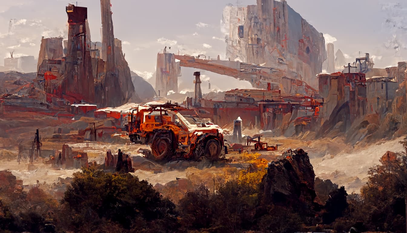
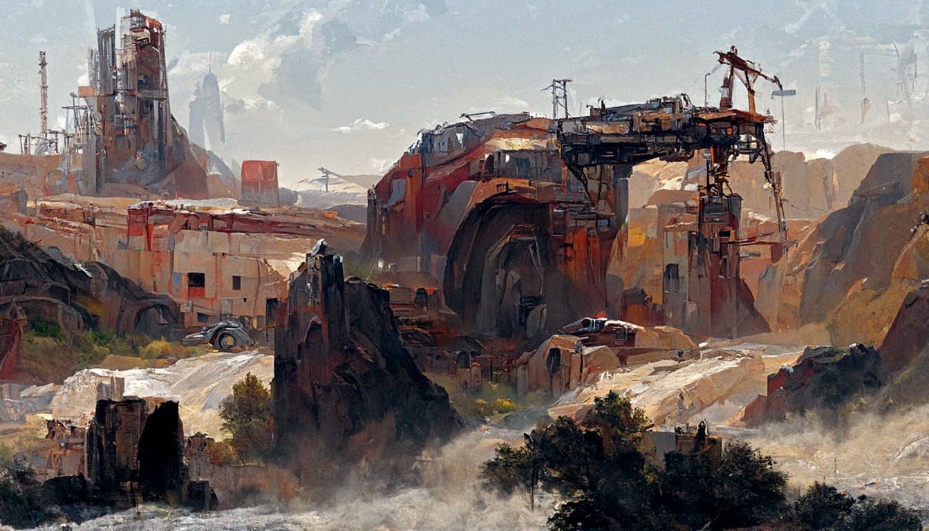
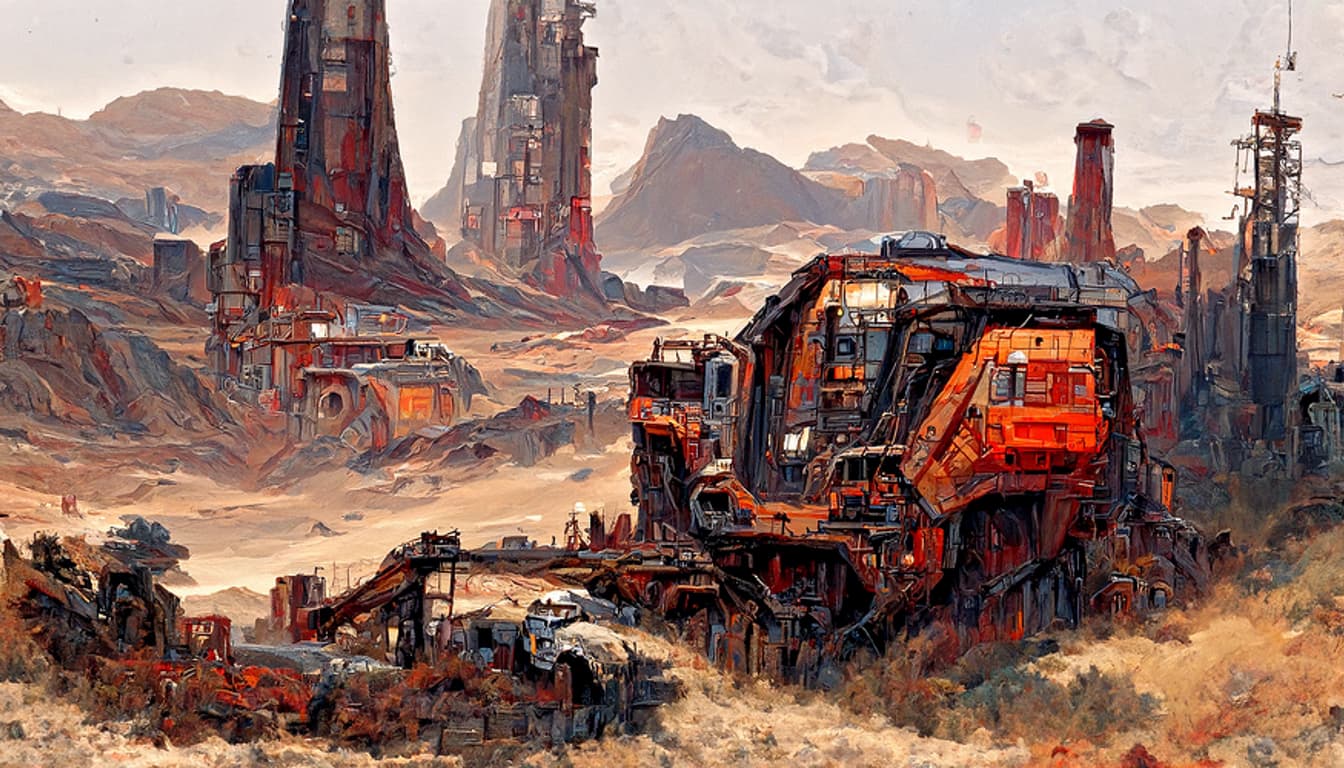
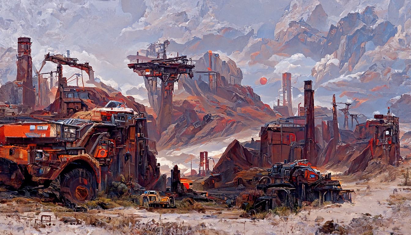
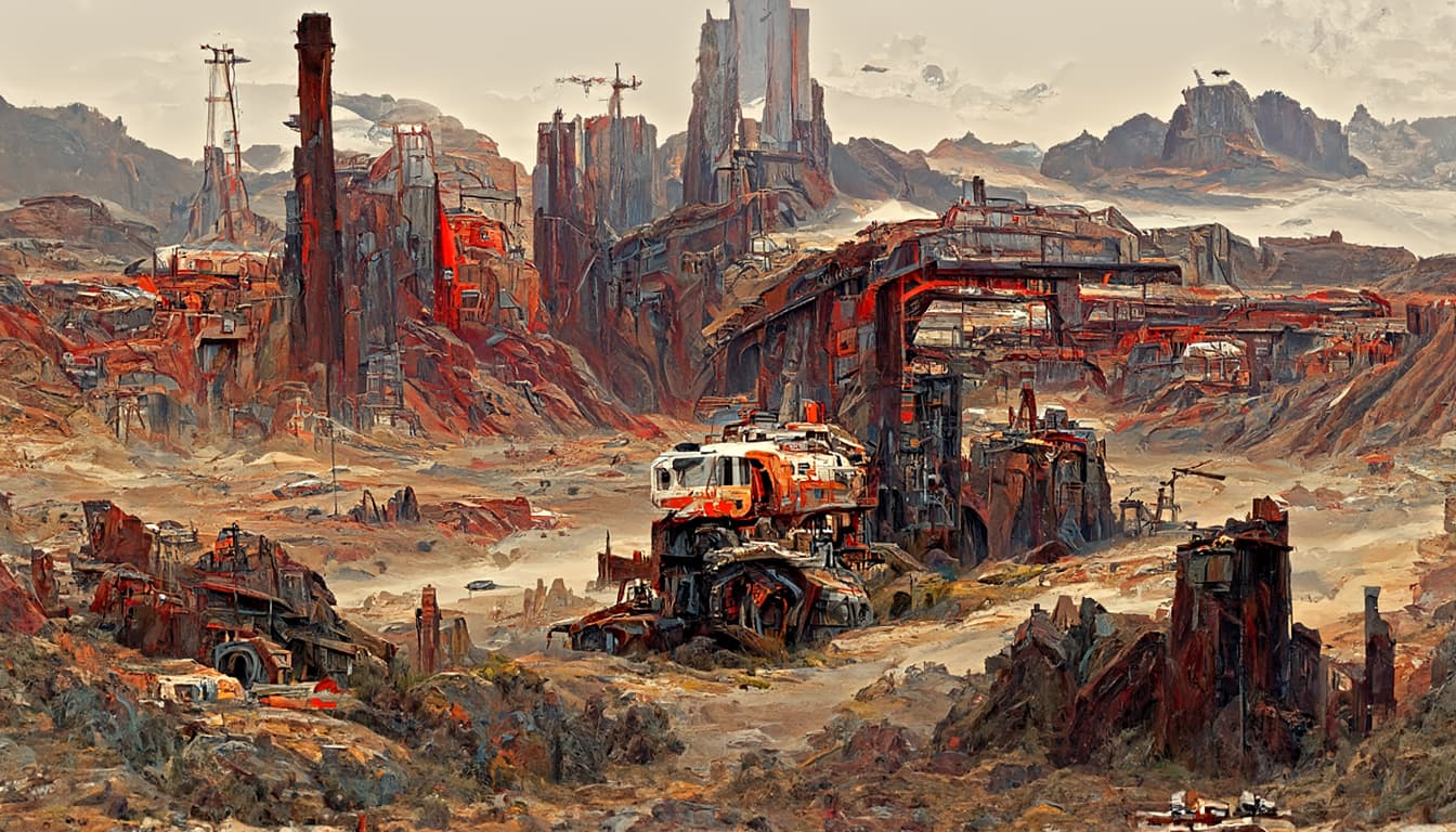
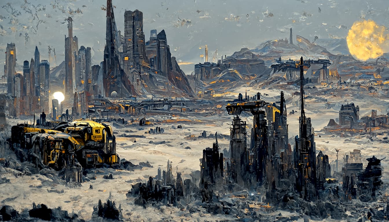
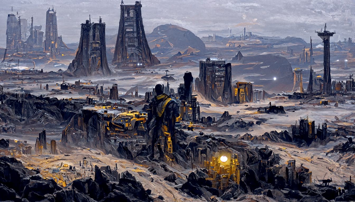
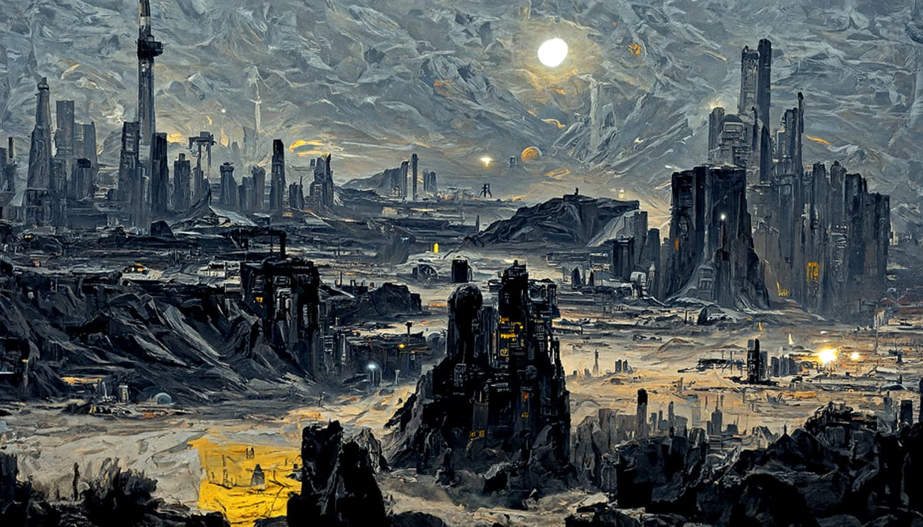
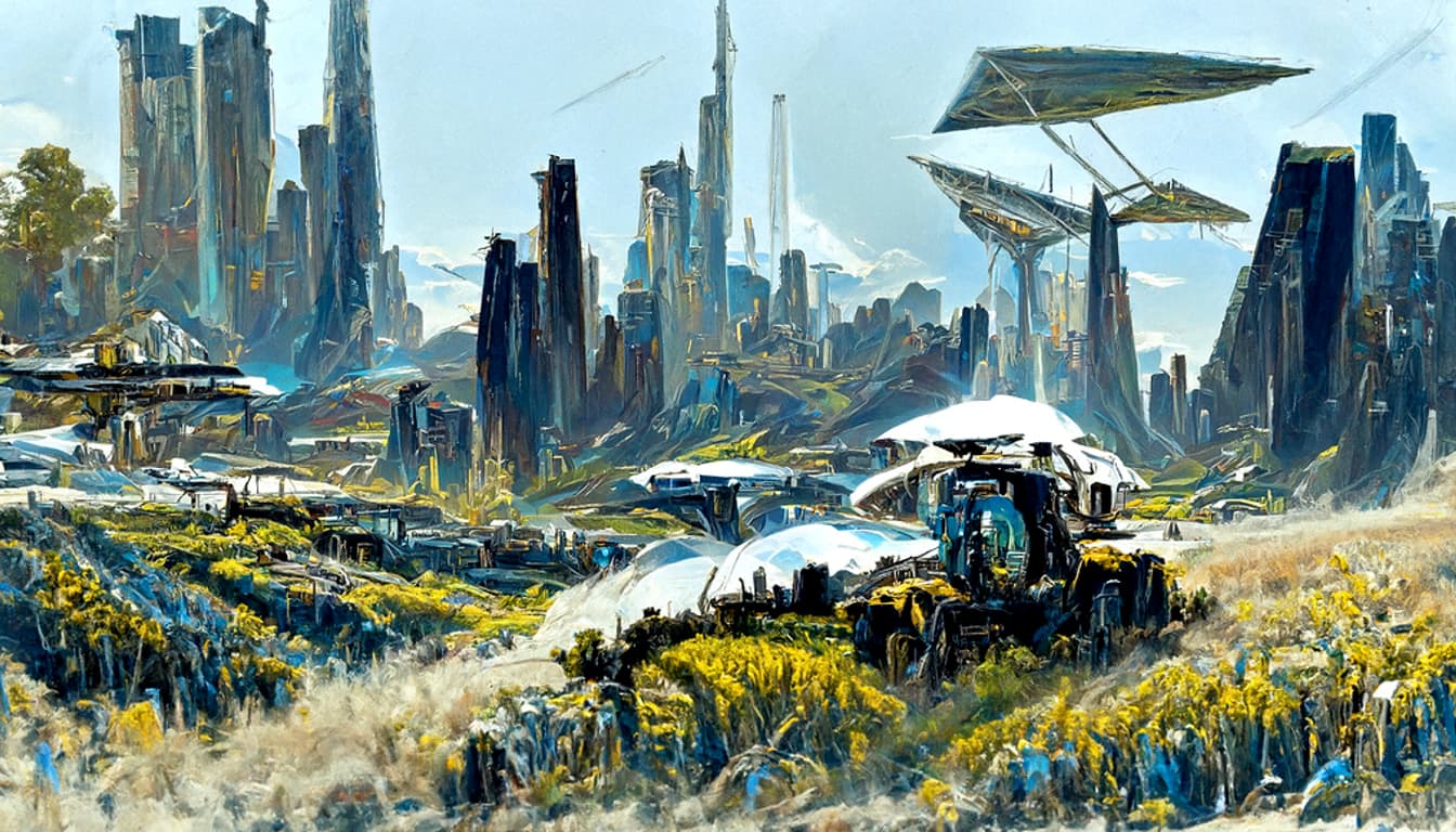
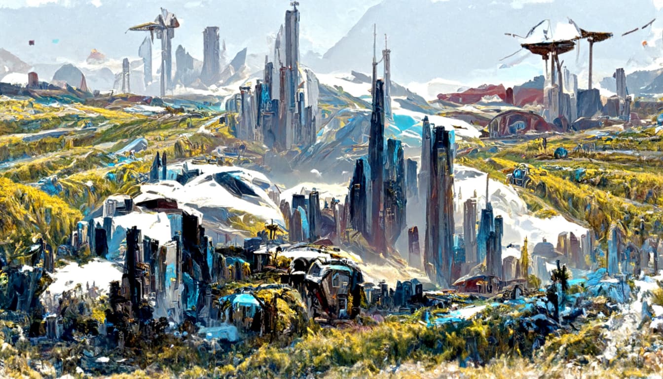
Batch14 with increased details. I pretty much approached the limit of detalisation. Theres not much i can do with the current set of settings in order to squeeze more fine details out of it, while keeping the same art style.
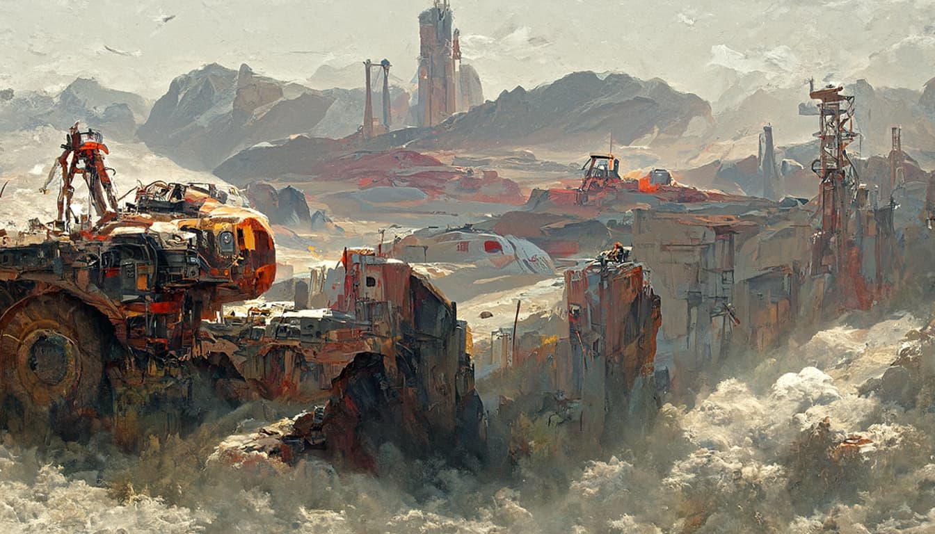

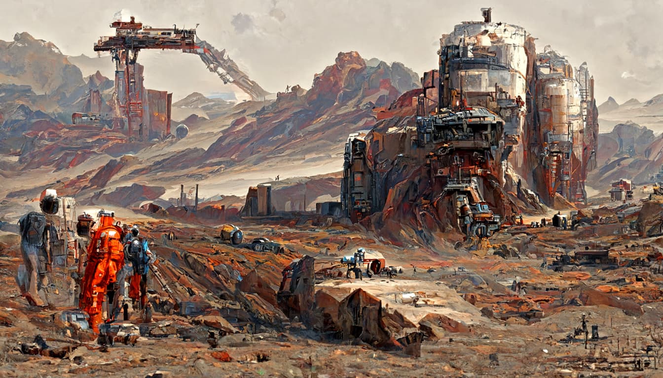
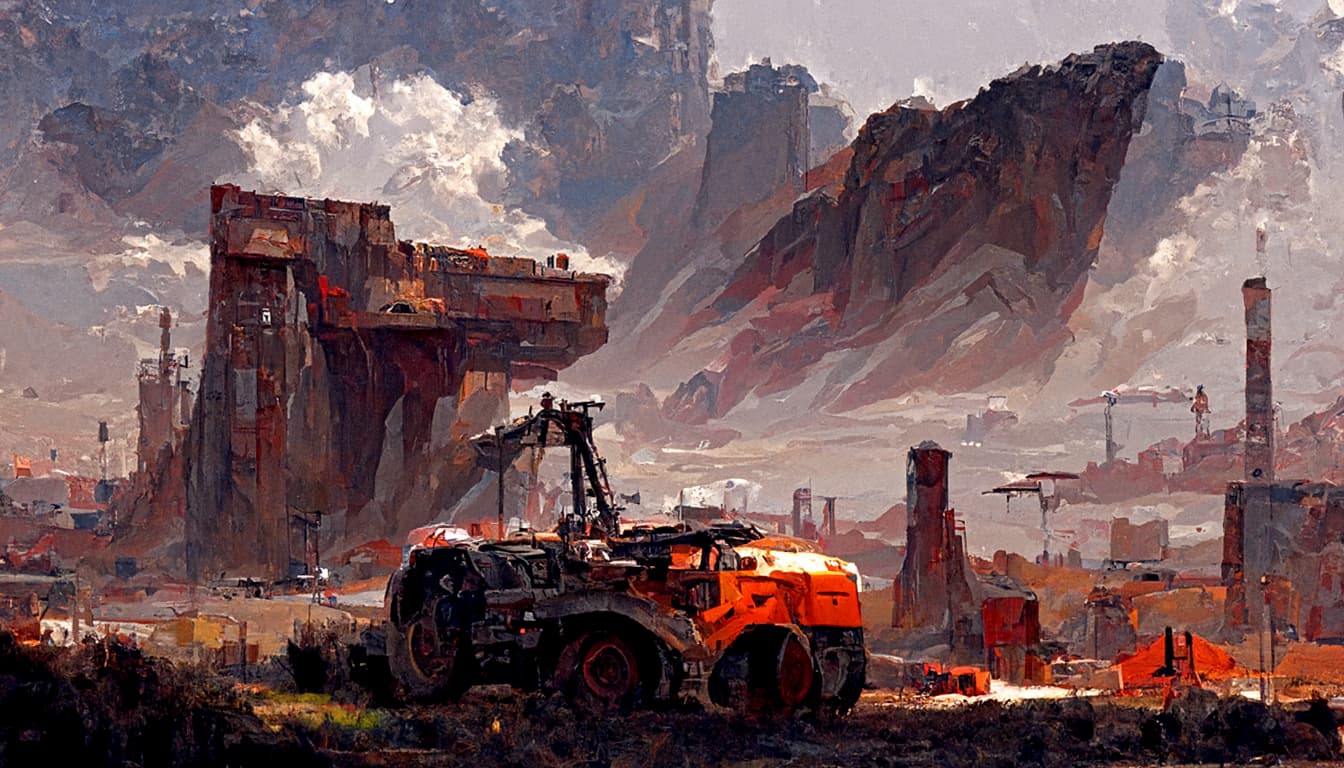
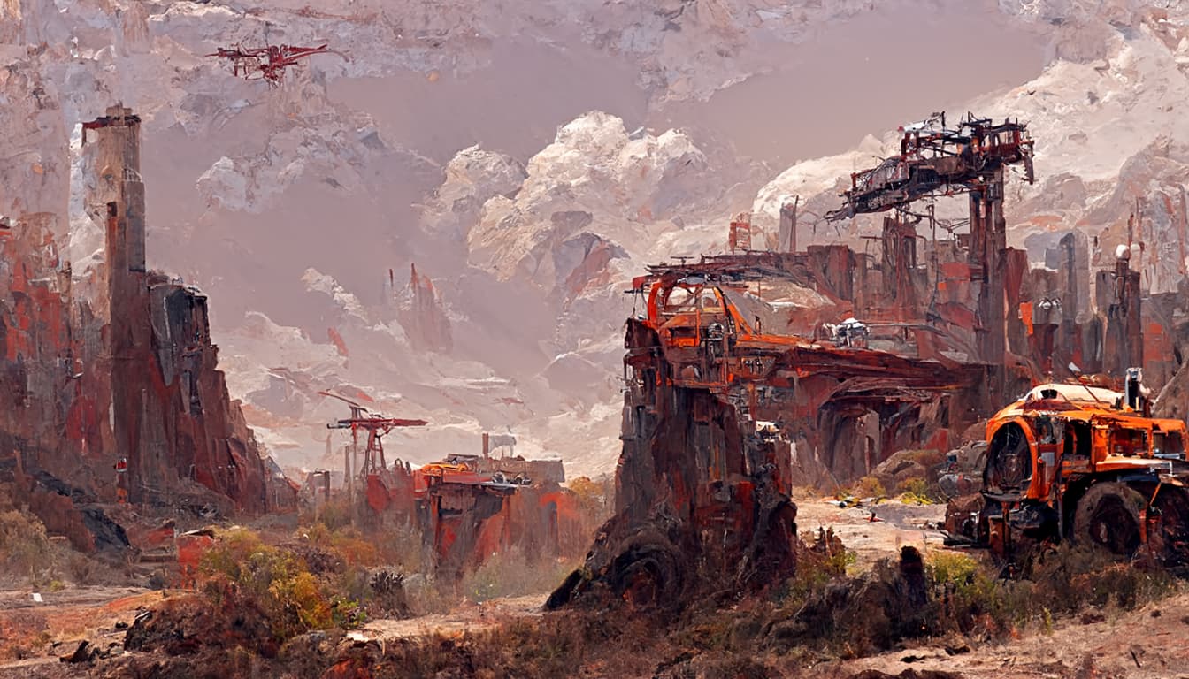
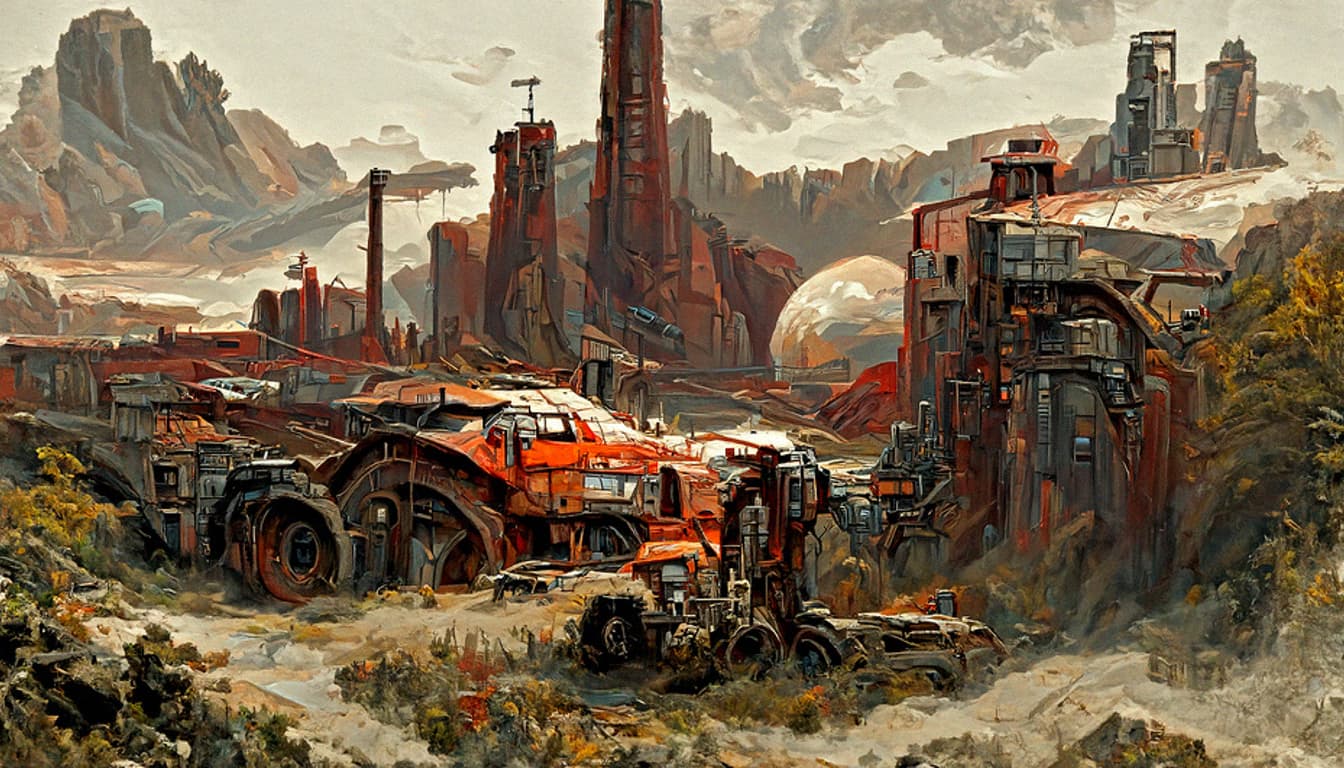
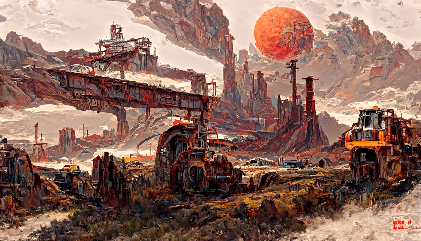
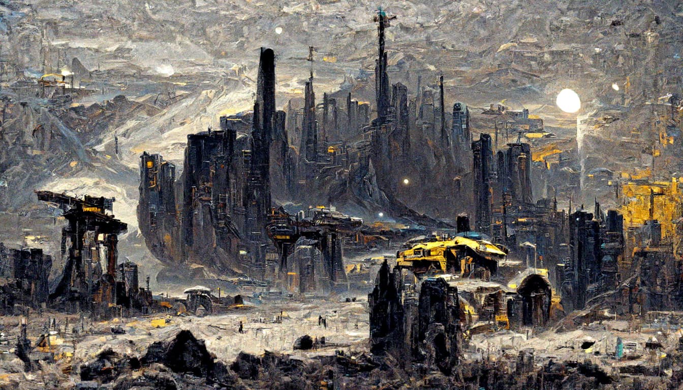
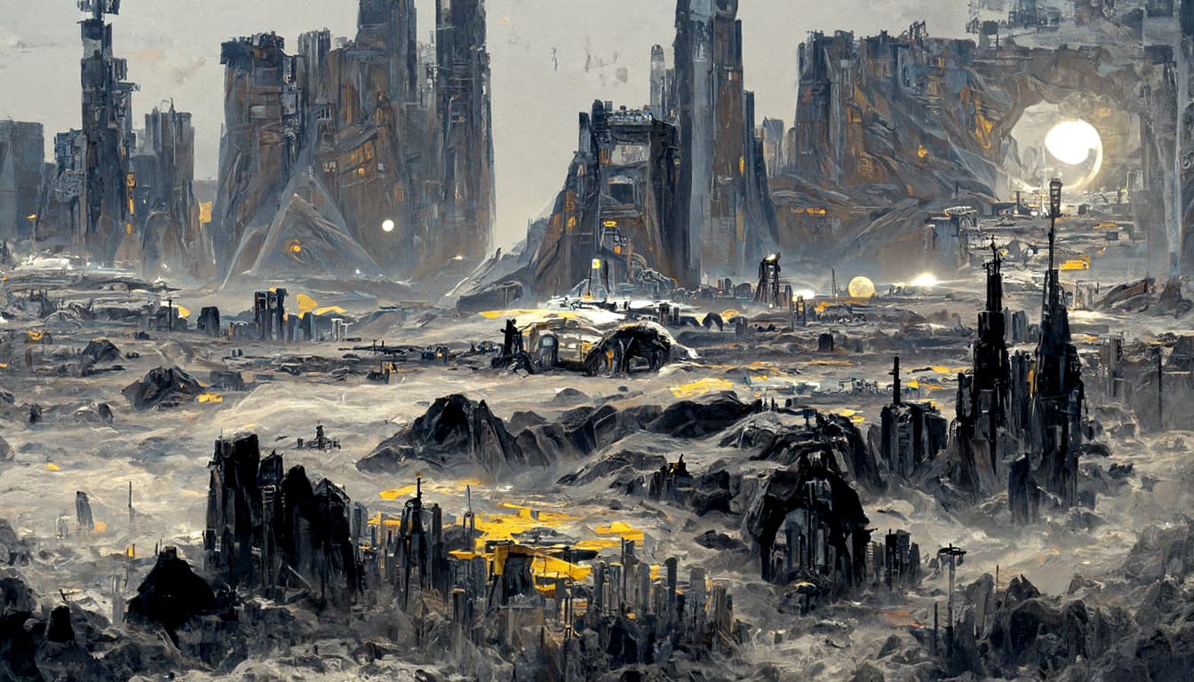
Experimental Batch18 which evolved from 15 and failed 17 (did not poast 17)
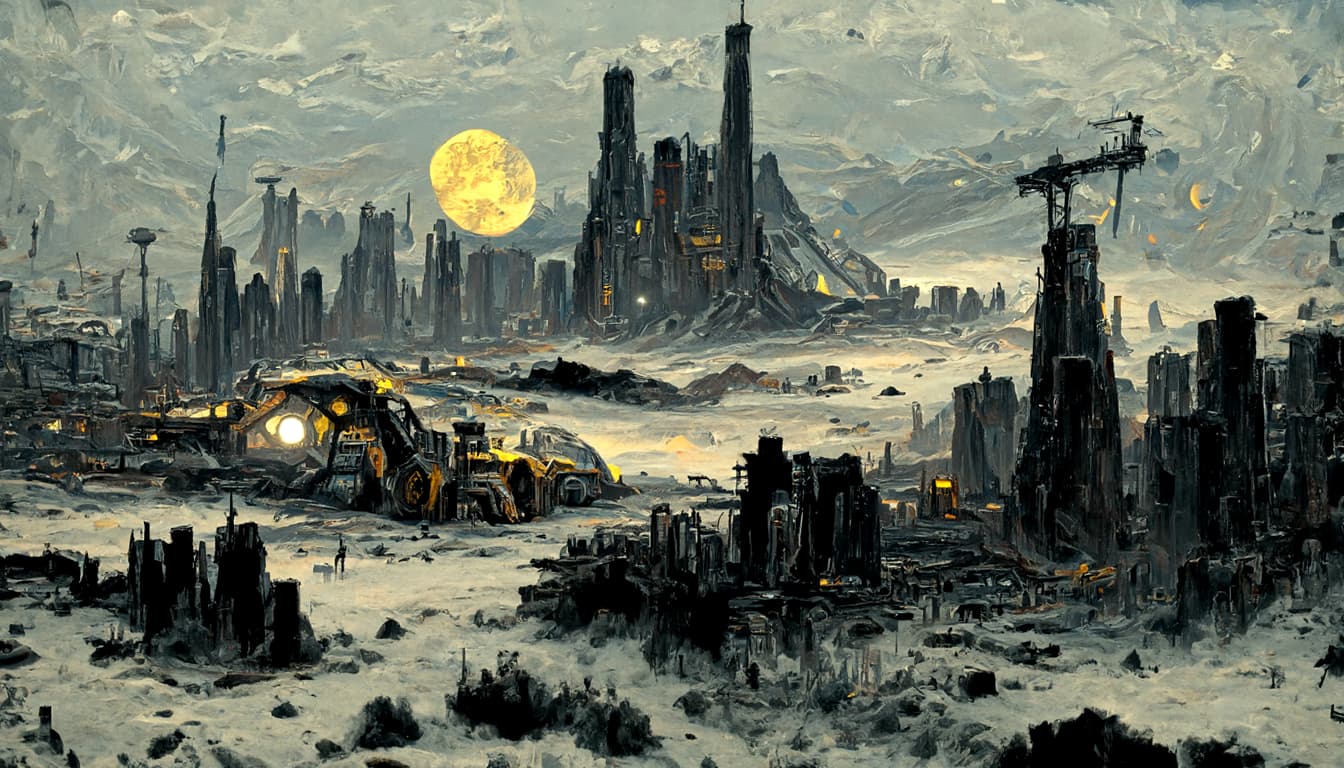
Very cool small details, sharper image, less smooth. Artifacts with word ASTRONAUT.
Some images would be perfect, if it wasnt for weird astronauts.
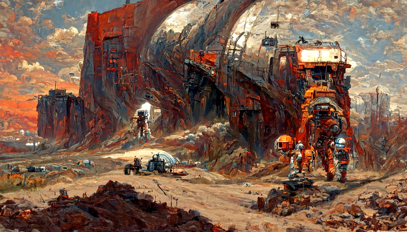

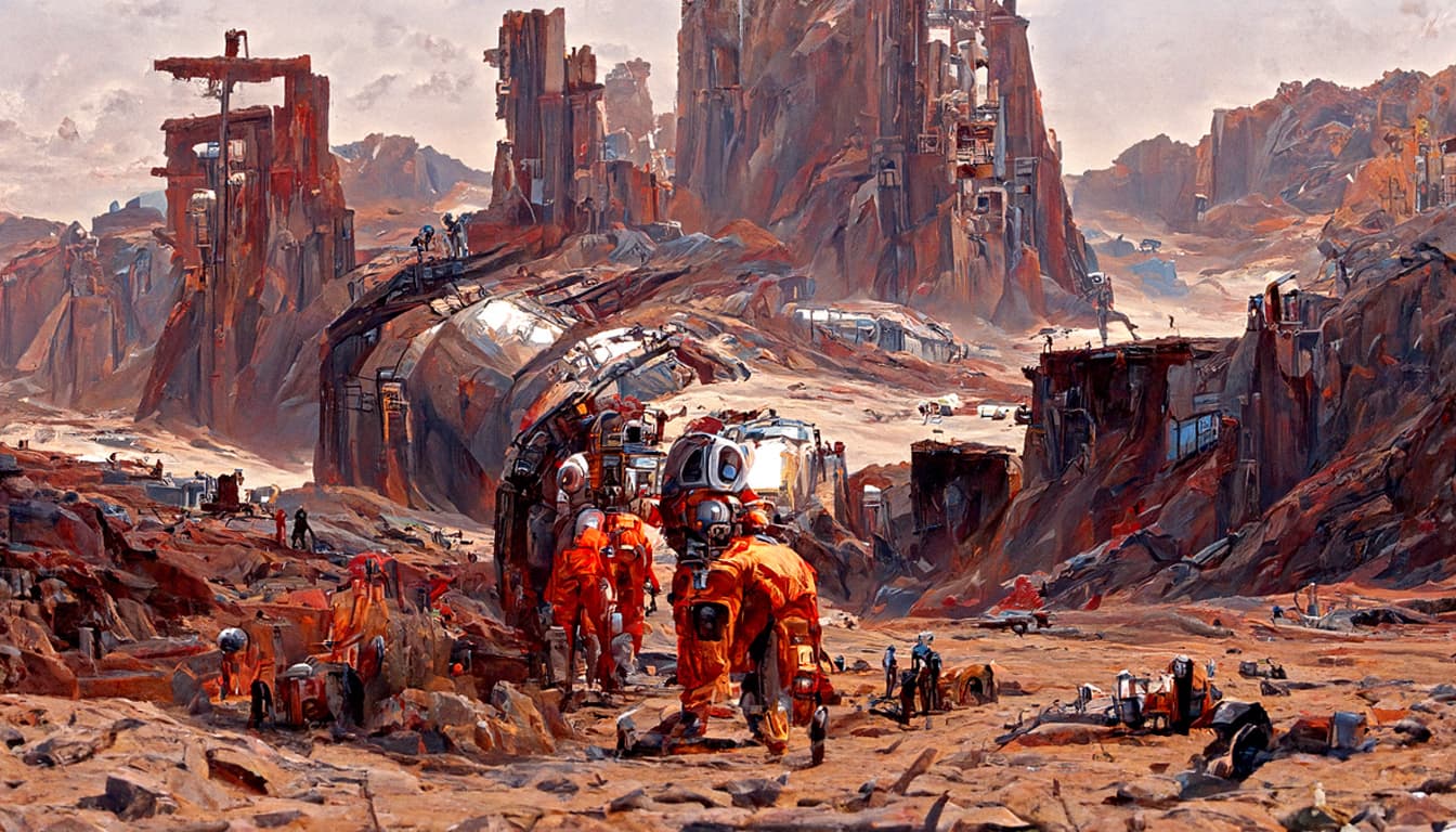
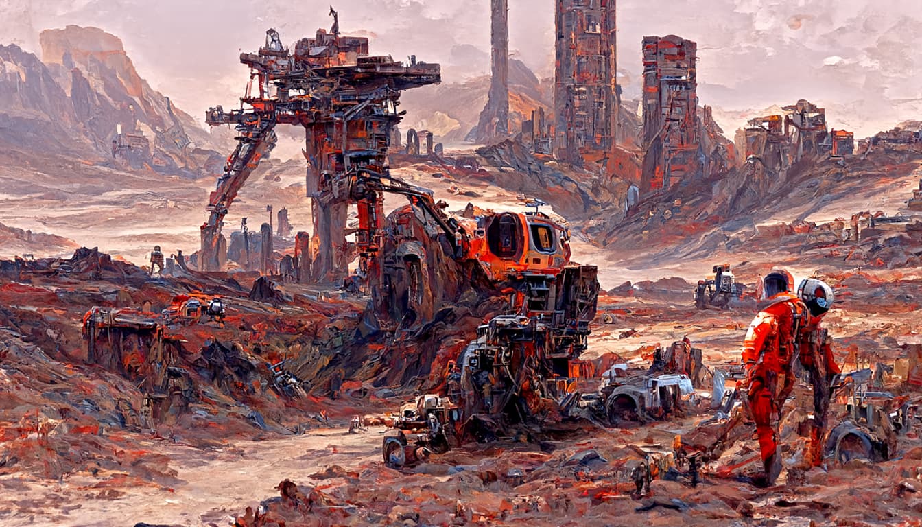
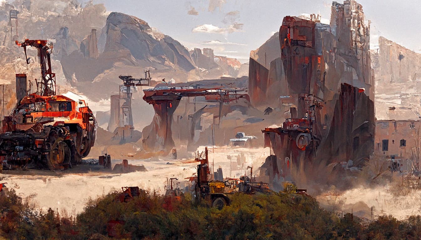
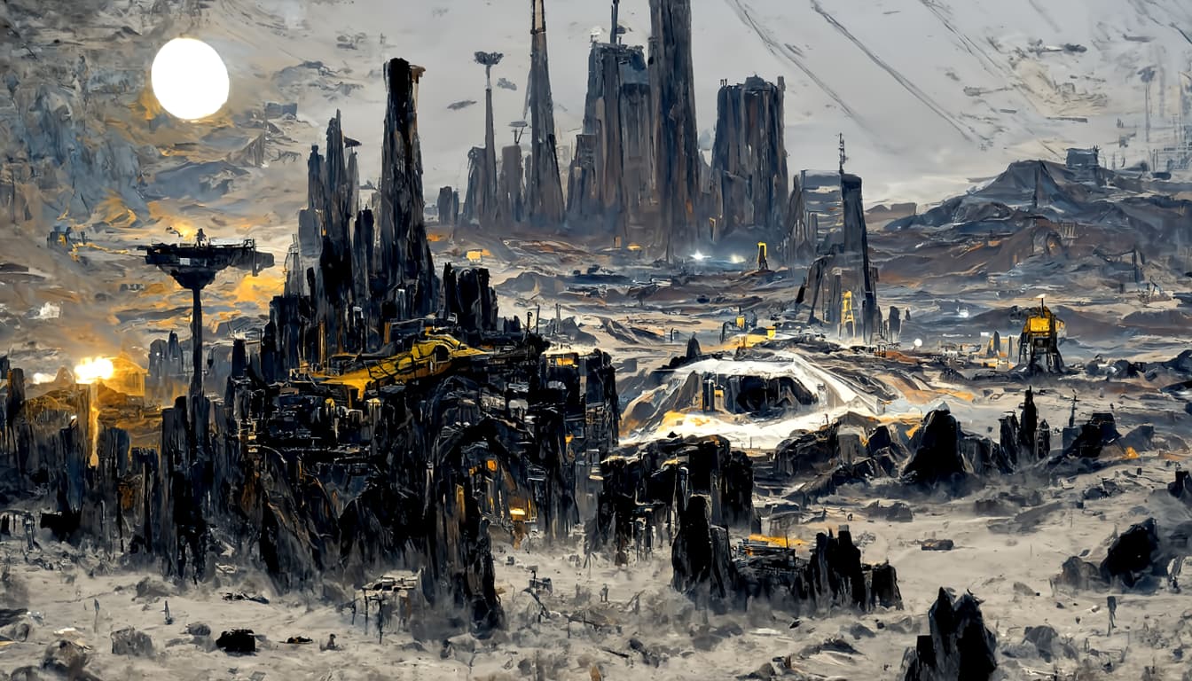
I removed astronauts from both batches and relaunched them. These are the final settings for both. We will choose a few successful frames and move on to another planet this evening.
Some good images in there, although I kind of liked Batch 14 with less details. And it might be a better idea in general for the AI to give a more “impressionist” style painting. I would expect that more detailed and realistic it tries to be, the more likely it is that the image contains weird looking half-formed structures and people. A mostly empty landscape with clouds is more likely to look correct, I would think.
Seeing this latest batch made me think that “machinery” might be a good prompt. Possibly “farm machinery” for the fertile worlds.
Higher accuracy on objects can be achieved if you focus on them specifically. Like faces for example can be perfectly constructed if they are the center piece of the image. However building small-tiny details is where NN fails, as you pointed.
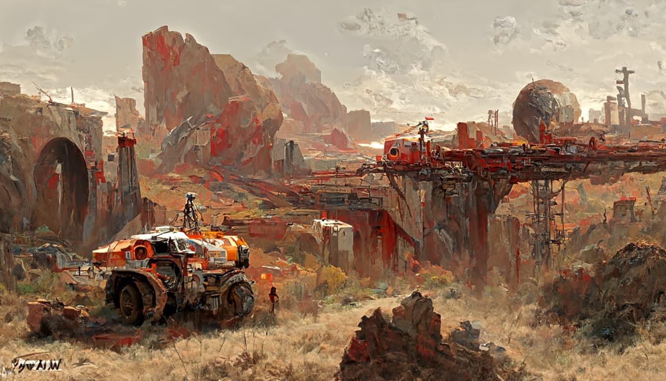
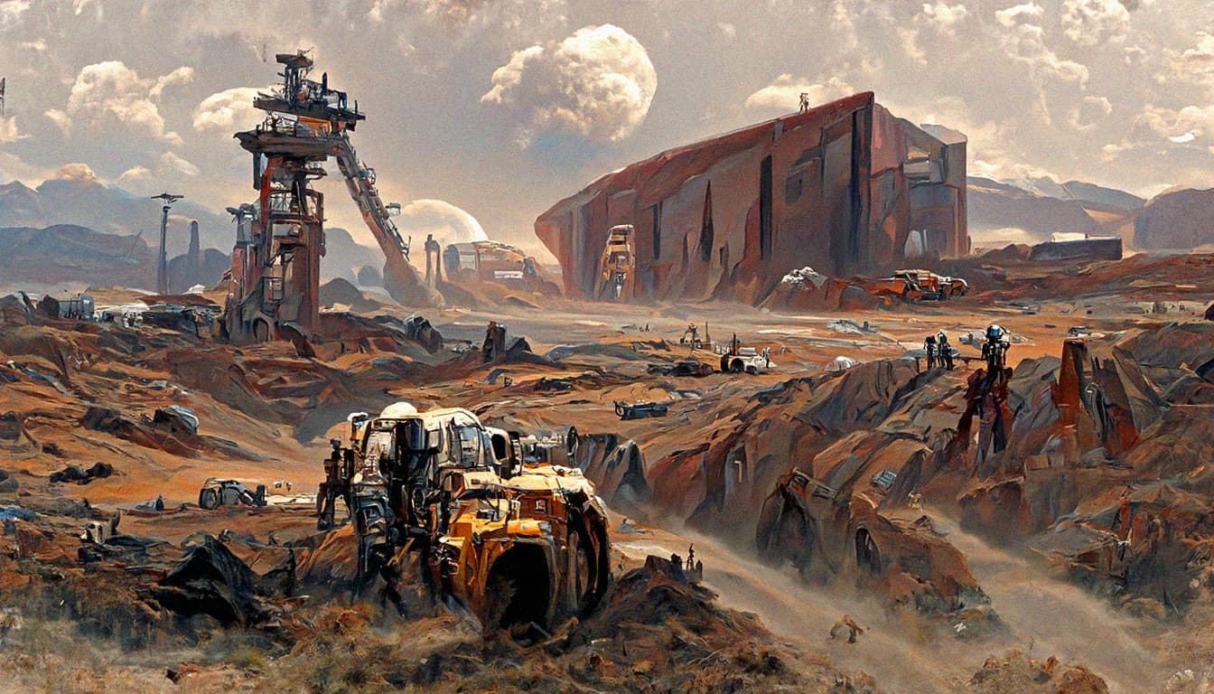
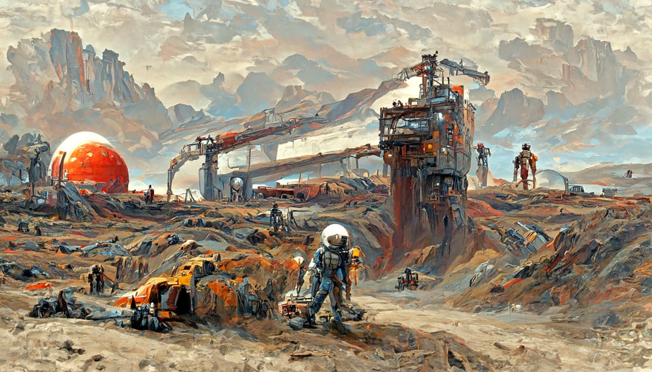
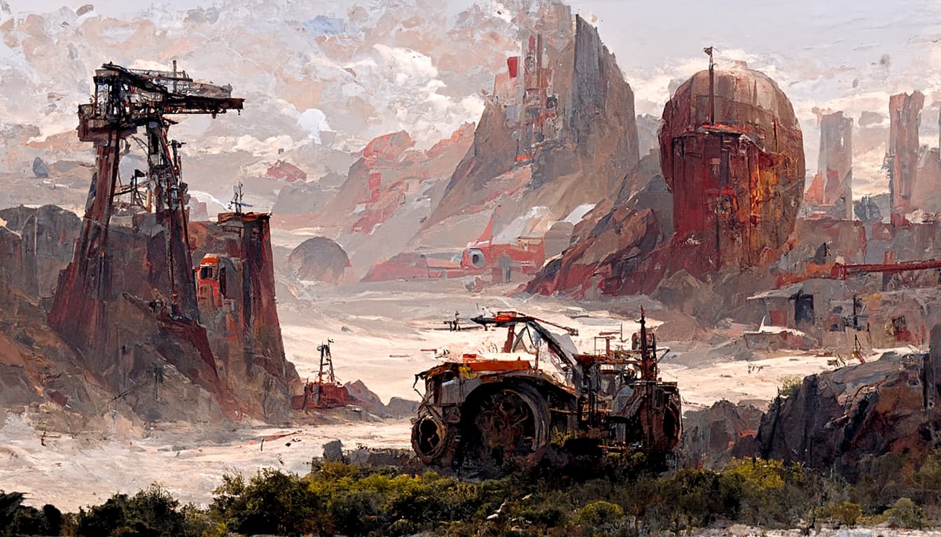
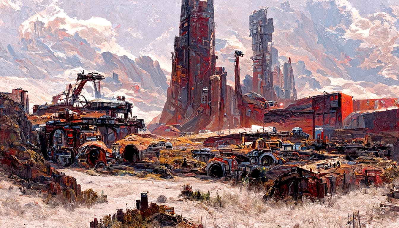
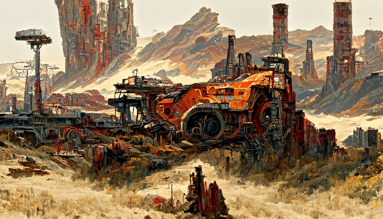
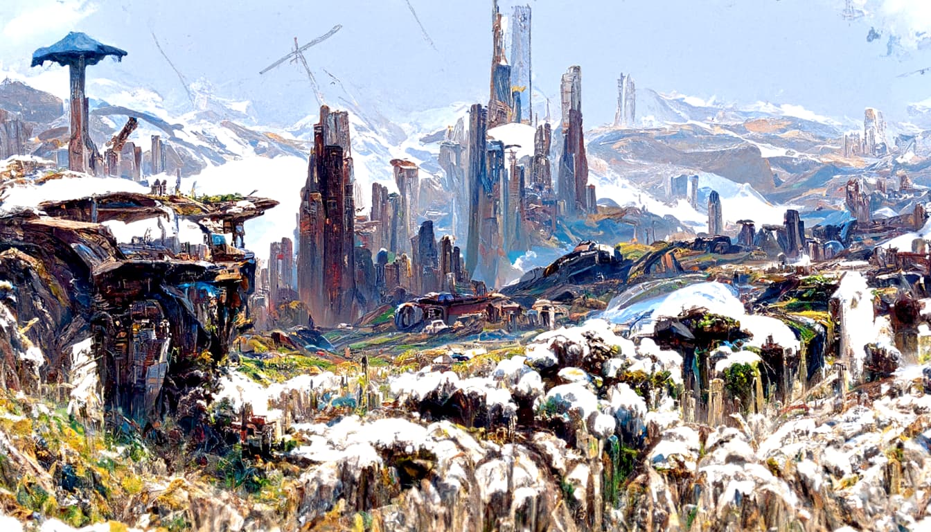
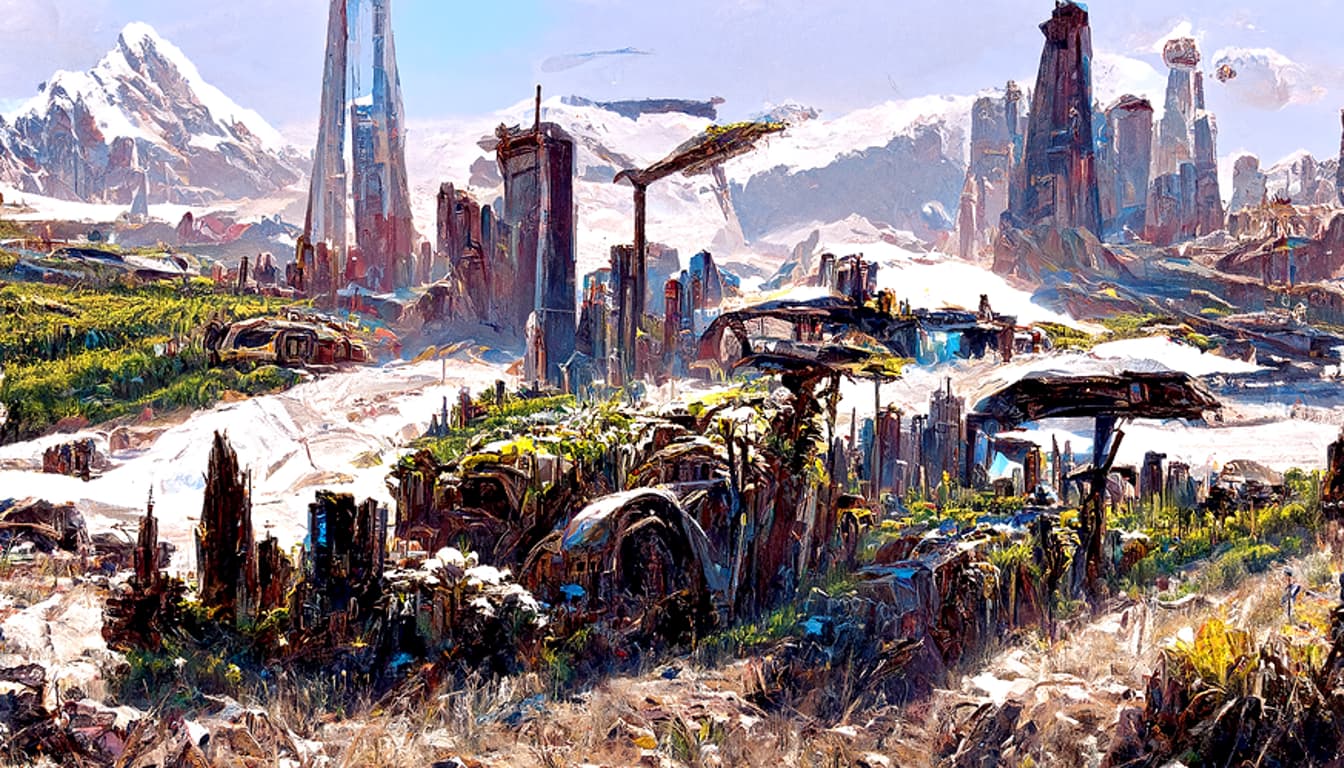
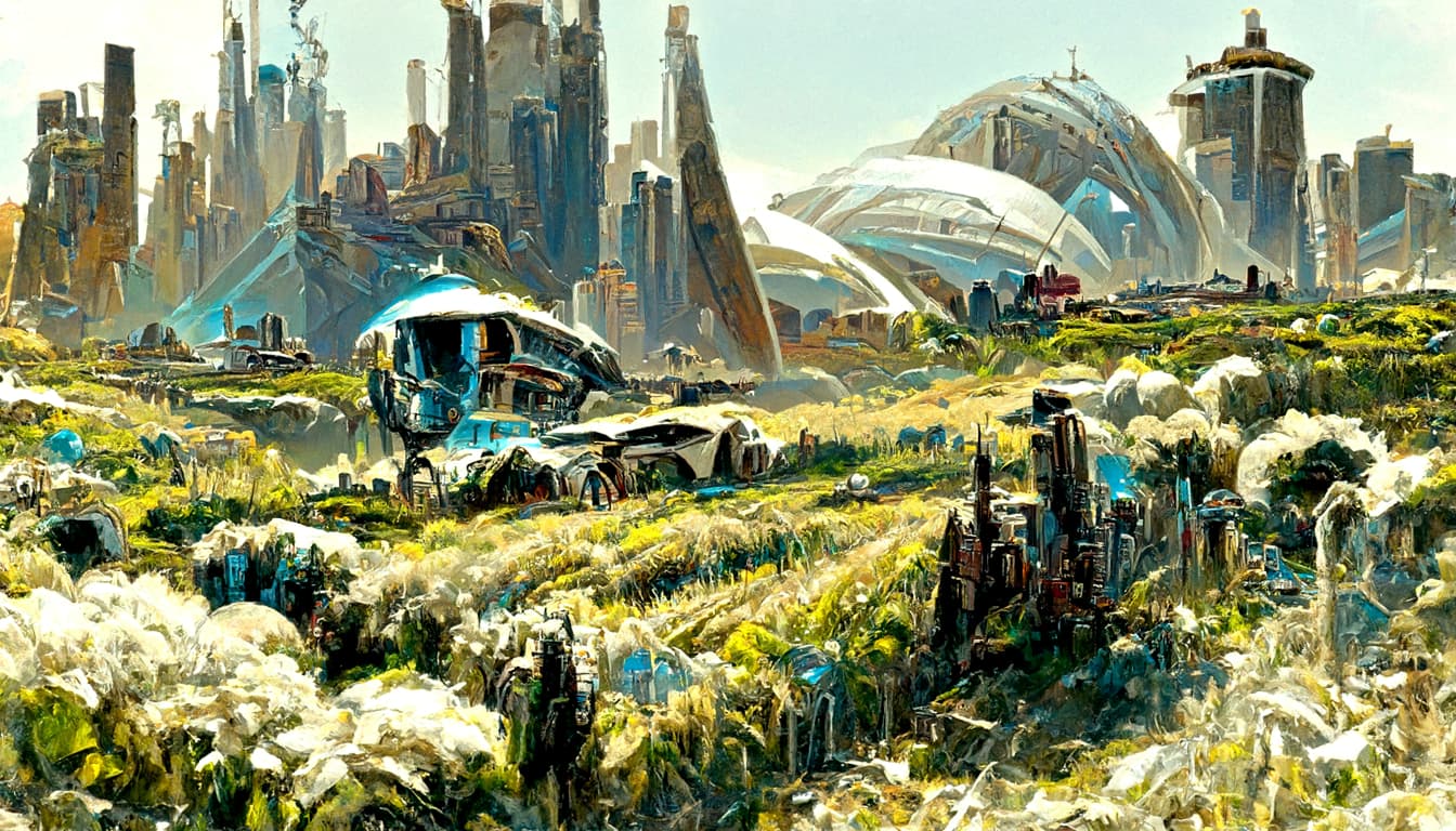
BATCH 14 without astronauts:


1 Like
Yes, these look pretty good. What was the prompt for them?
Also, how do you tell the AI to focus on an object as the center piece of the image?
Same prompts, minus the astronauts.
A sci-fi painting of a landscape, bright daylight, sparse vegetation, clear blue skies, dark orange and red soil, light gray rocks, sci fi industrial buildings, industrial vehicles, by Albert Bierdstat and Paul Chadeisson and Hubert Robert, Dan Mumford style, Trending on artstation.
To center on a specific location or shape you either provide an initial noise map, or initial image.
Initial image can be anything, like your own face, and then you tell it to either stick to original or moprh it into something new, some other face of example.
With initial noise map you provide something like this:
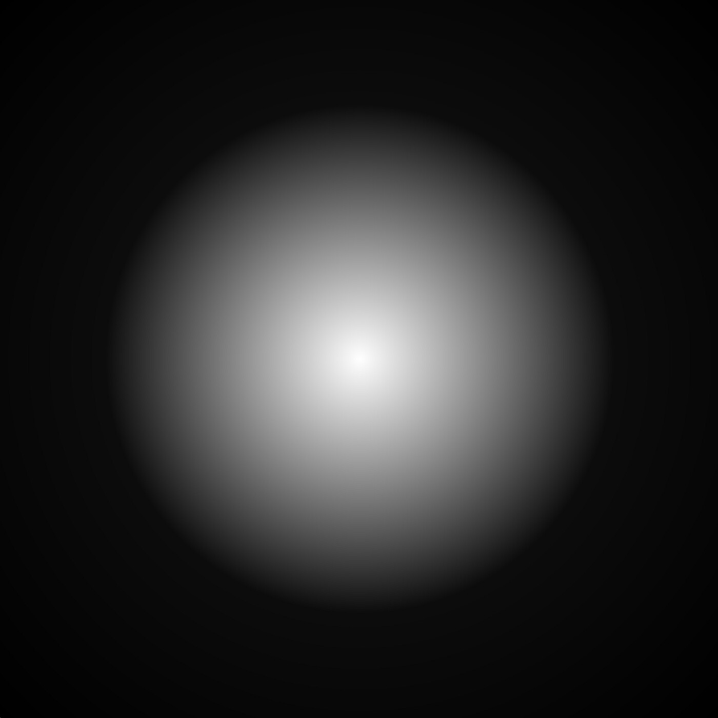
So it will only fill the center circle and make it look like a planet for example, or as if you are looking through a telescope or whatever. Noise map can be of random shape, or can be very specific.
I dont use either. Initial noise map might generate very good results for landscapes, but initial images are still glicthy and may be protected by copyright license. I cba to check for license of every random image, so i just use random noise.
I was hoping it would be something like you can tell it to have one instance of a thing in the foreground, and then everything else is used to fill in the background. e.g. “a painting of an industrial vehicle”, and then “red soil, light gray rocks” are things that it uses as scenery, rather than making them the focus. Currently one of the problems is that it tries to use the astronauts and vehicles as scenery too.
But maybe the AI doesn’t understand what the focus of a painting is, as opposed to background scenery. I guess it’s just copying the style of thousands of existing paintings.
Unfortunatelly this model does not always understand adjesctives ONE, TWO, BIG, SMALL, etc.
I may try adding additional models later on, but it will change the style of the image yet again and will take significantly longer to render 1 image. It does not copy all artists, but it does apply the ones i indicate on top of known shapes of Astronaut, Industrial Building, Machinery.
So if artist i have chosen have painted portraits and i will ask it to paint landscape, i may end up with mountains with faces etc.
I am still experimenting in parallel, but from what i saw from other peoples results painting limbs, legs, fingers etc, is always a problem unless you focus on them via init_image or init_noise
I can guide its focus abit with weights, saying Astronaut:5, Industrial Buildings:2, Machinery:3, Mountains:-5
So in this case it will add more astronauts, few machinery and fewer industrial buildings and is forbidden adding mountains.
That may be a solution.
I would set in stone current setting from Batch18 and generate Montem, Avalon, Promitor, Umbra, Boucher.
In parallel i will keep exploring what was said before and see if we can get it to focus more on specific parts.
1 Like
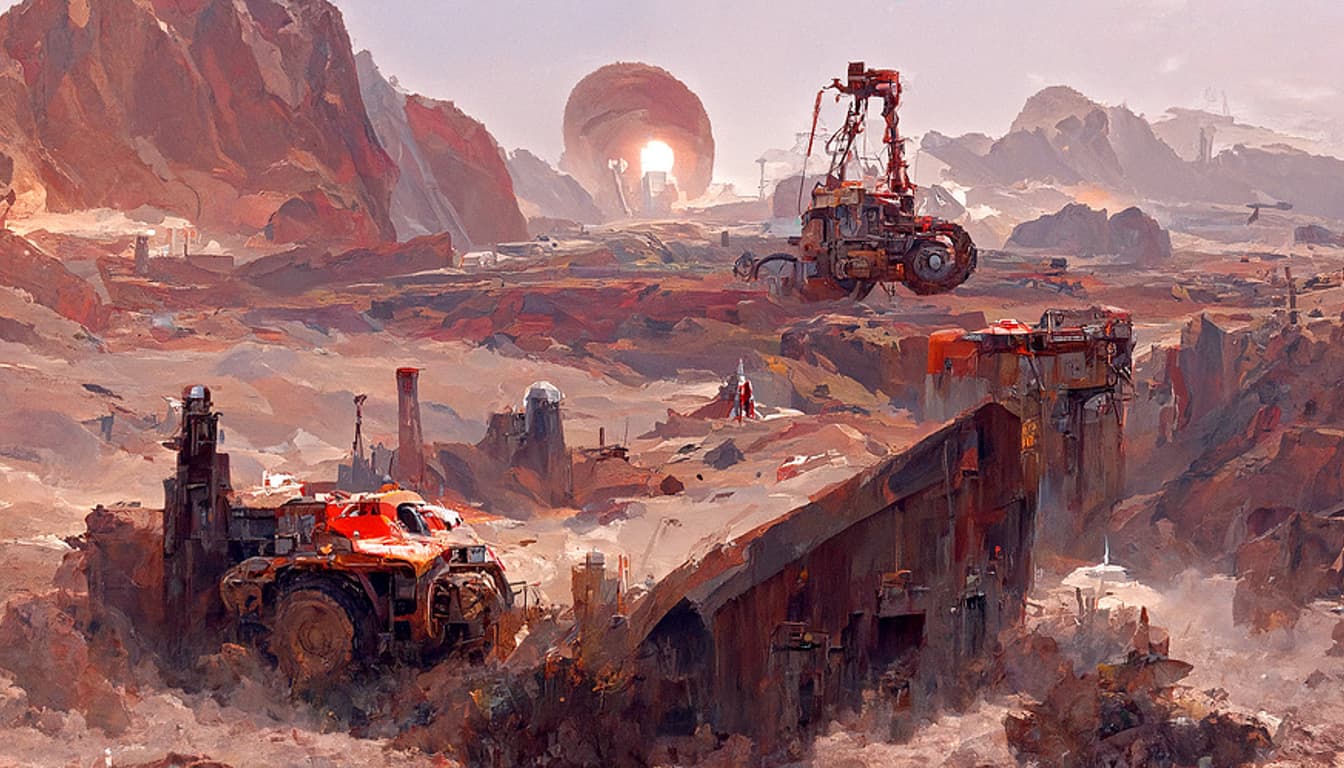
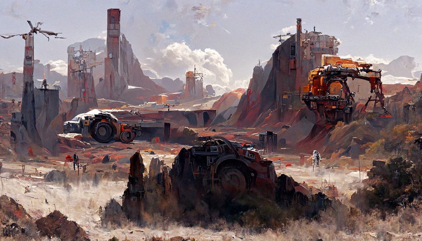
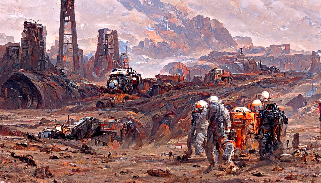
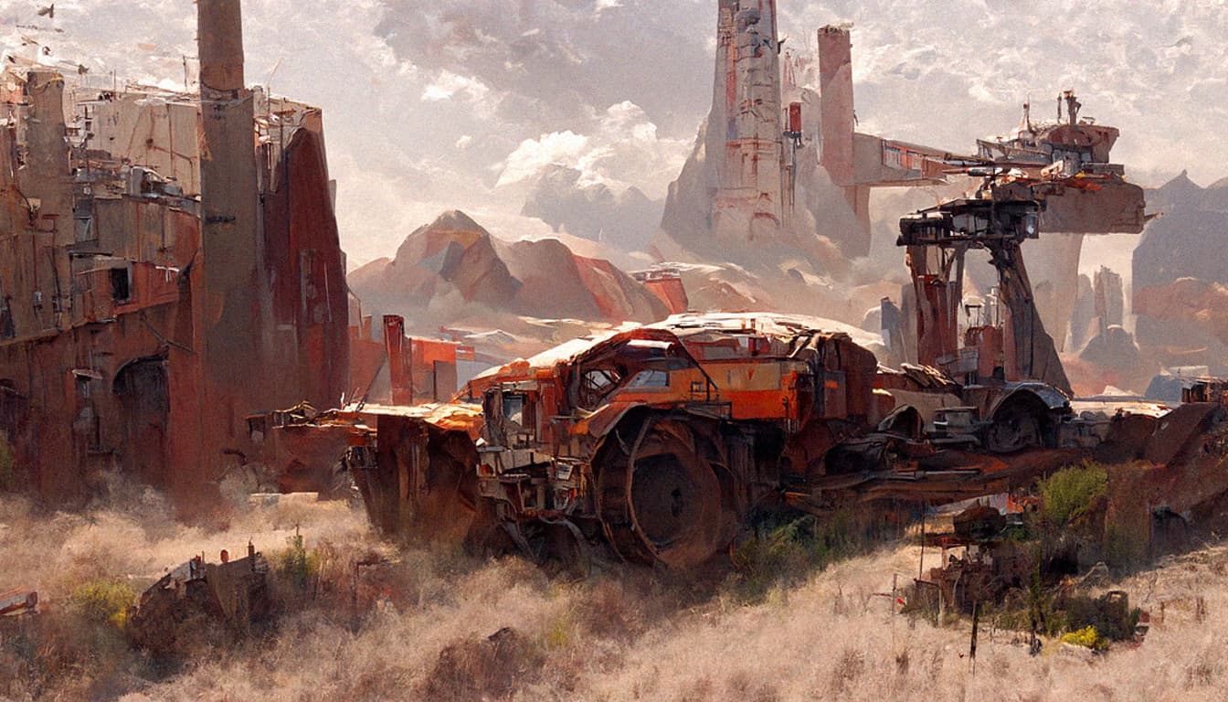
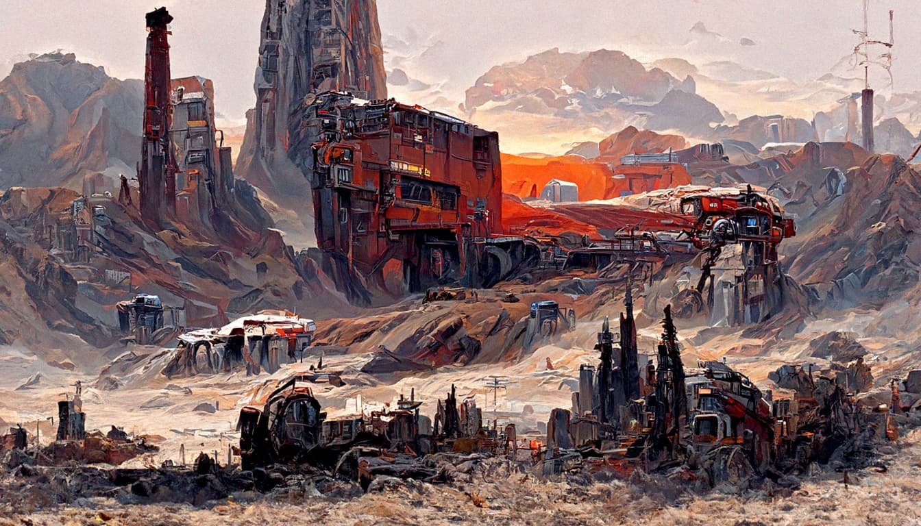
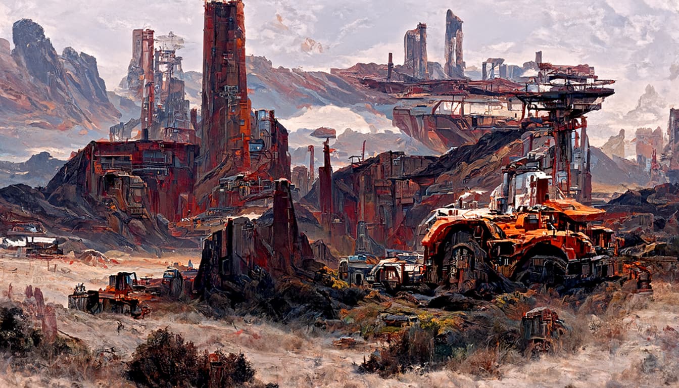
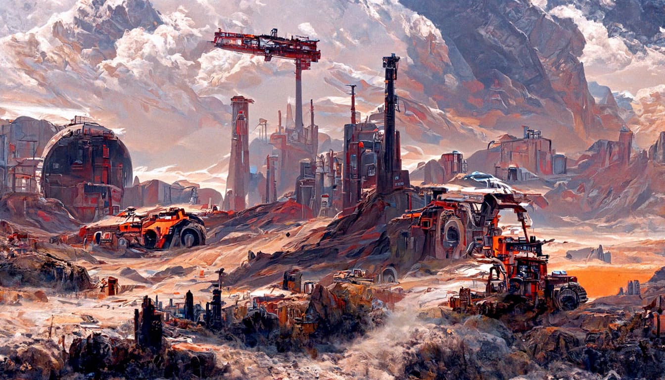
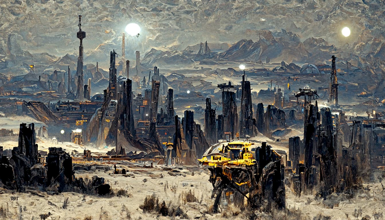
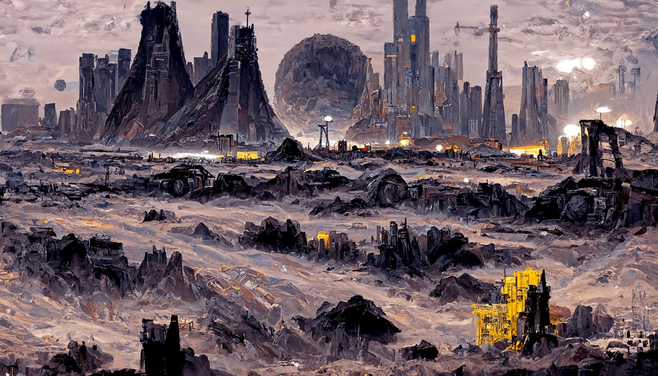
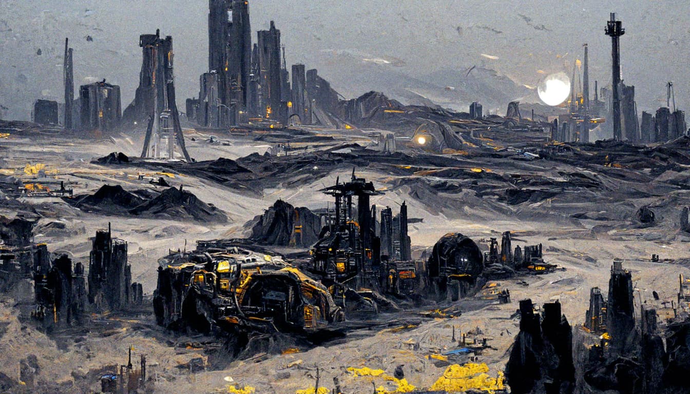
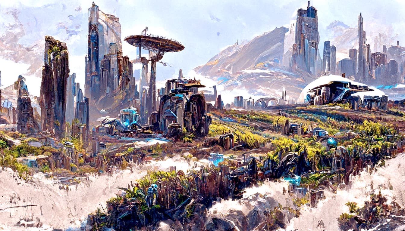
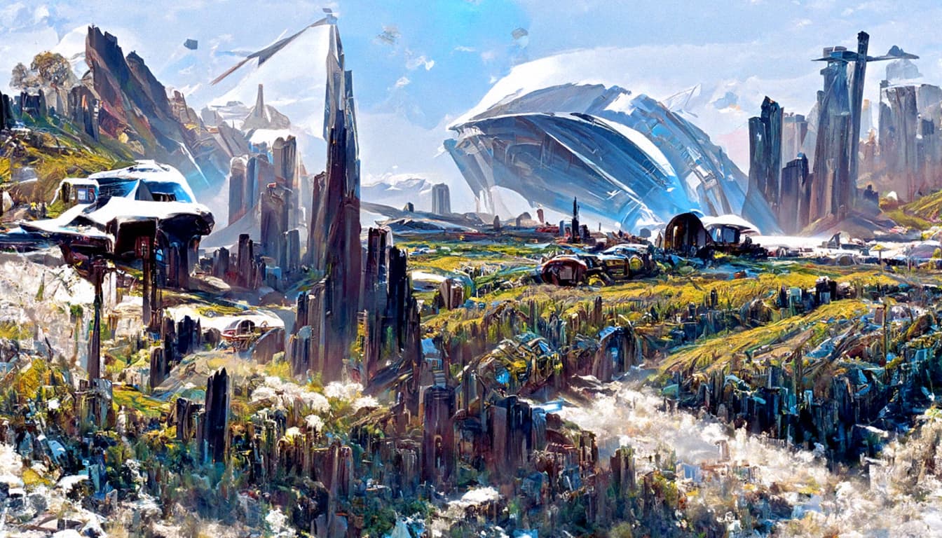
Updated the Batch 18 with last 5 images.
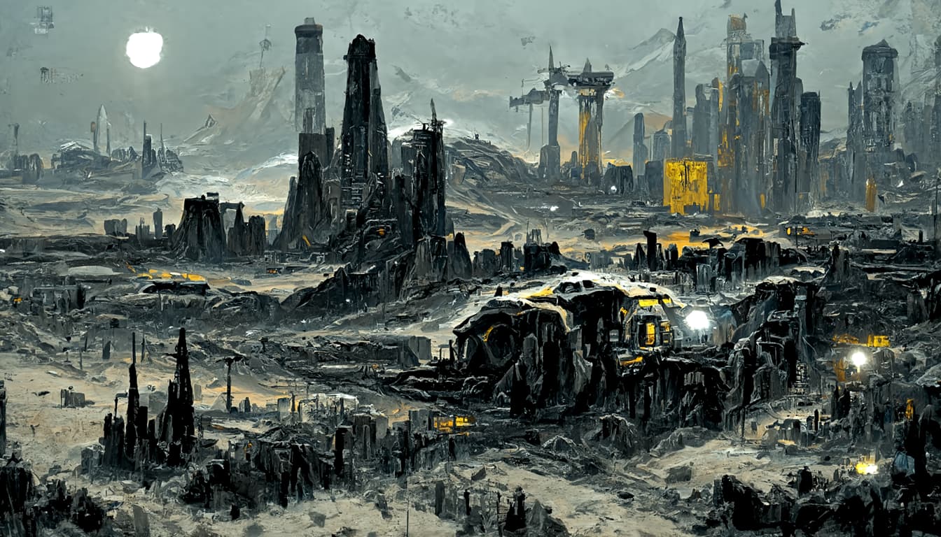
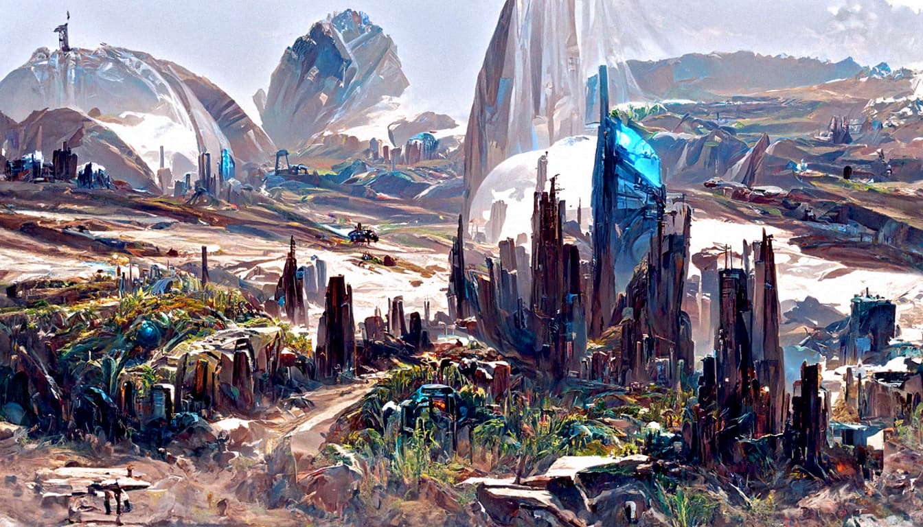
BATCH 18 AVALON
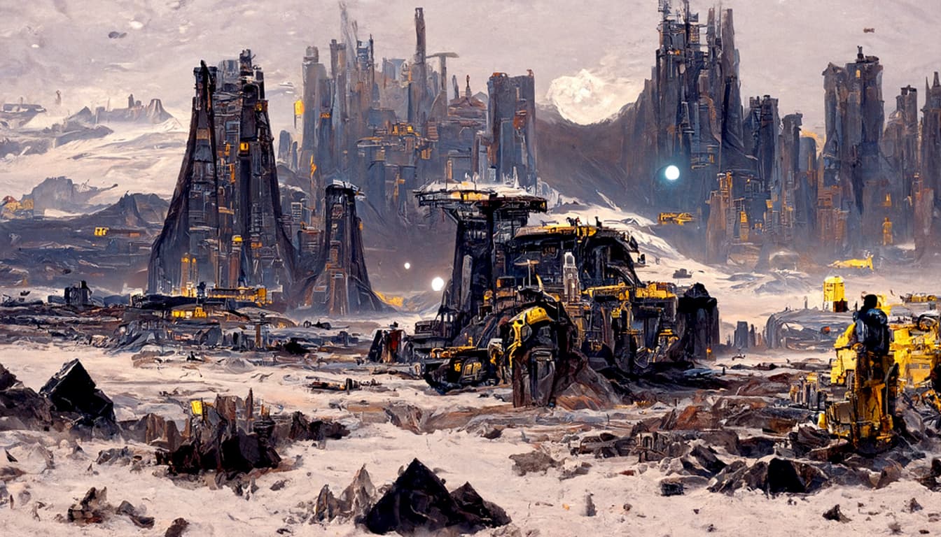


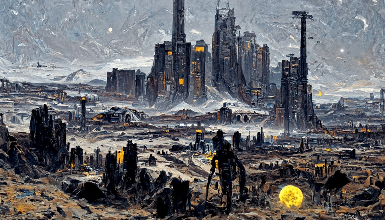
BATCH 18 AVALON WITH BLACK SKY AND LOWER range_scale (contrast)
Not much difference from previous settings. I will try one more time to get it to use a lower color pallete.


1 Like
Is that with the same settings? Because the sky seems to have issues.
Also, it’s too bright for Avalon. I guess “night time” doesn’t work as a prompt. You could try “sunset” or “twilight” instead. Hopefully the AI won’t then try to add sparkly vampires to the picture.
Yes, same settings. I might tune contrast setting abit to allow for more vibrant color on Avalon, so it does more black.
Also will try BLACK SKY instead of night.
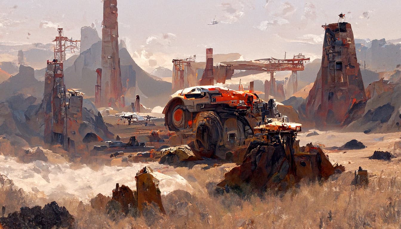
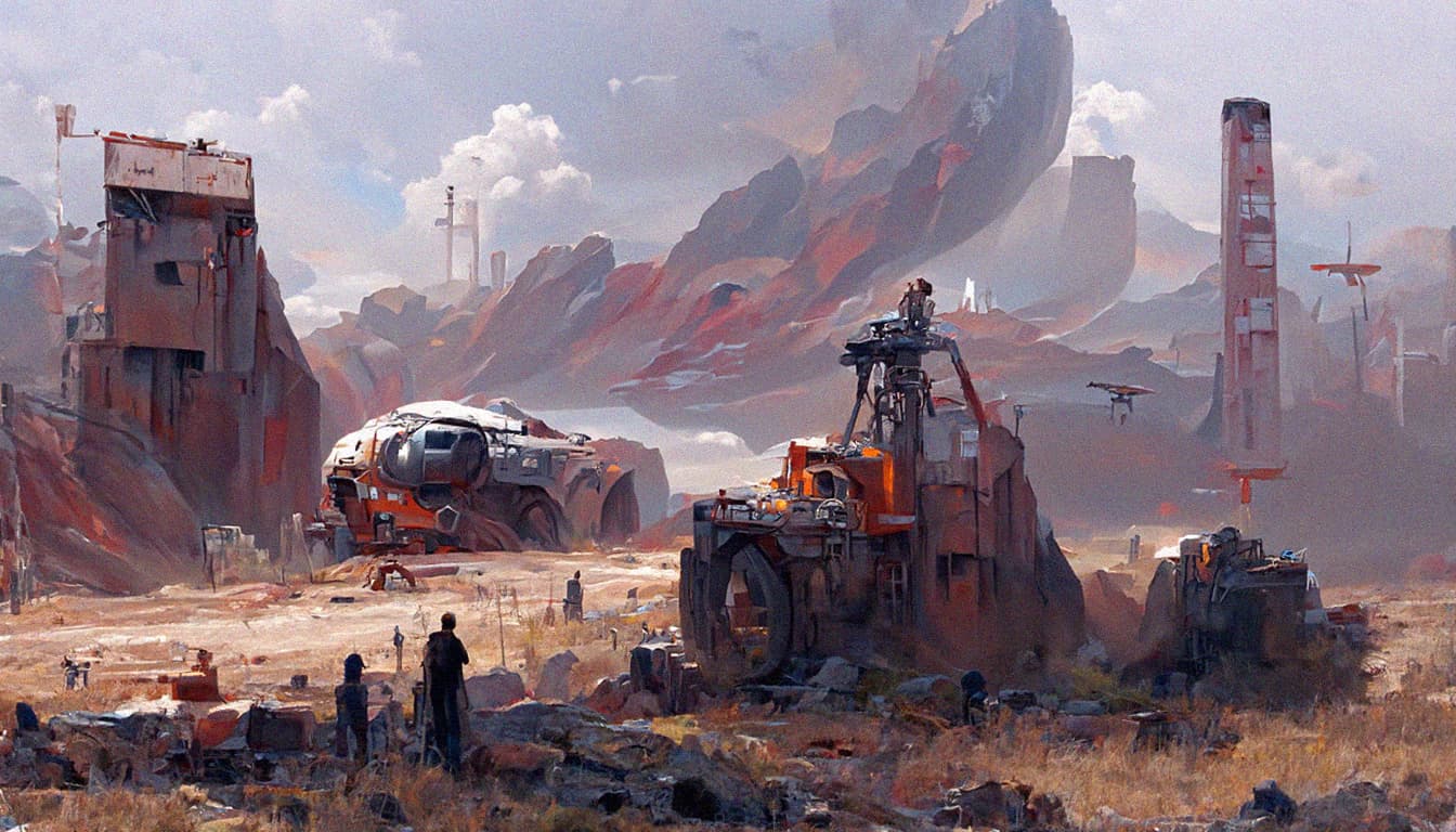
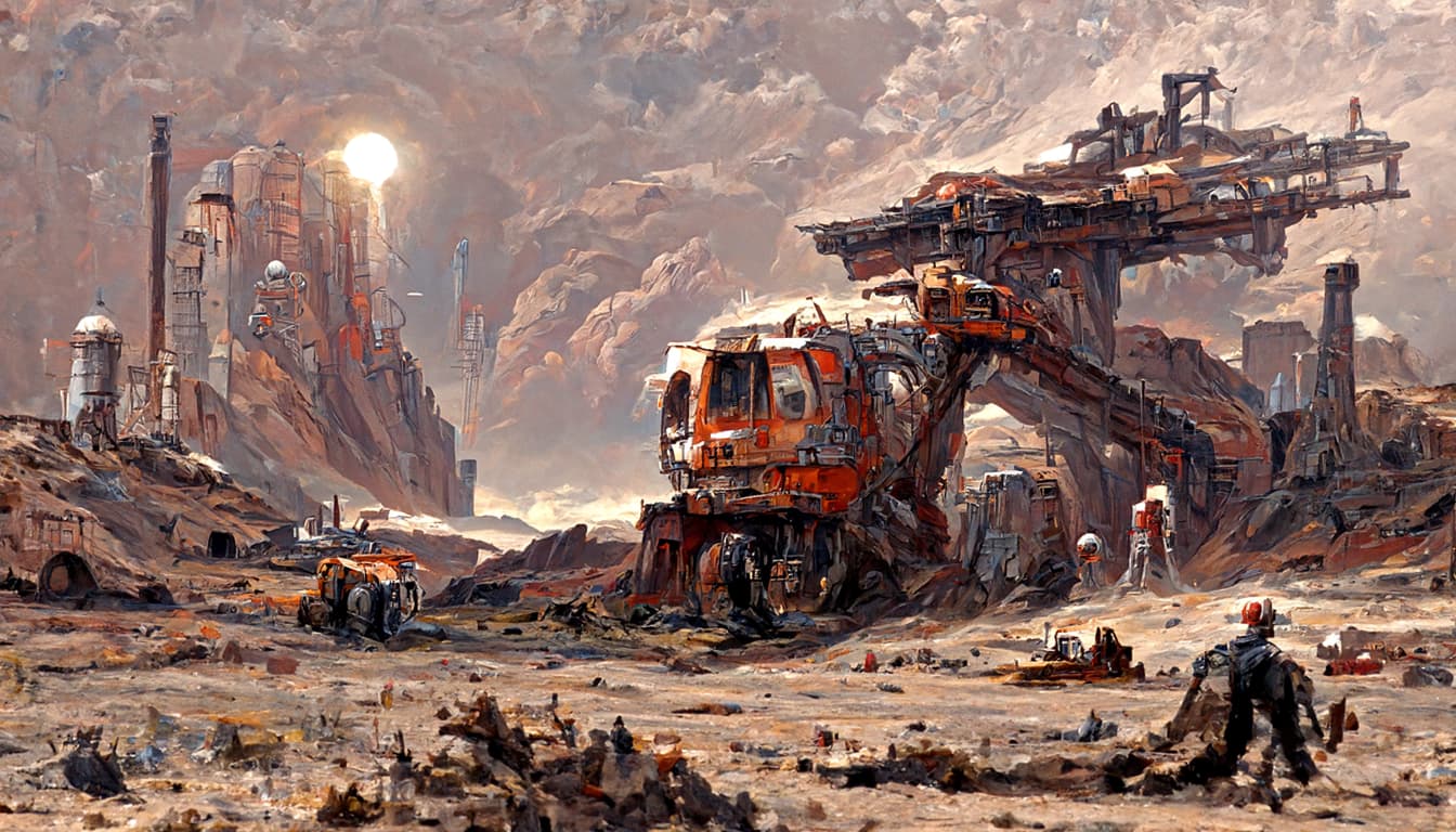
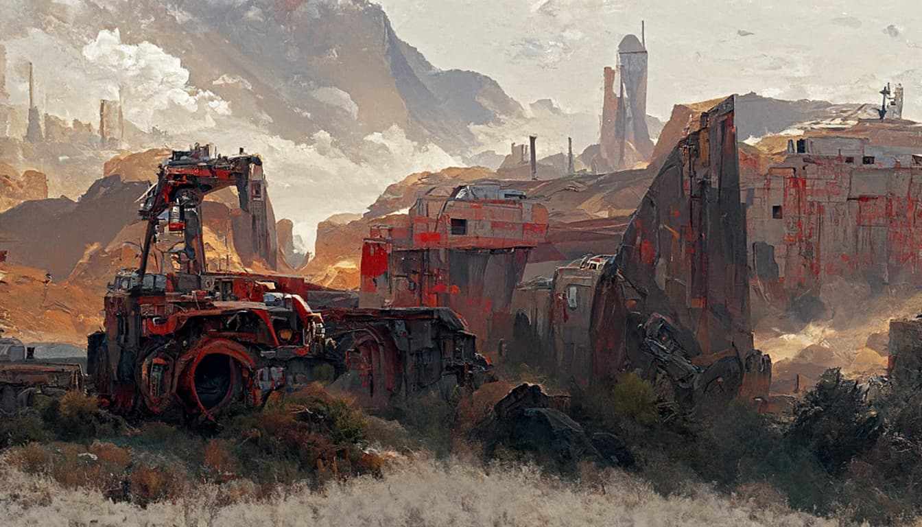
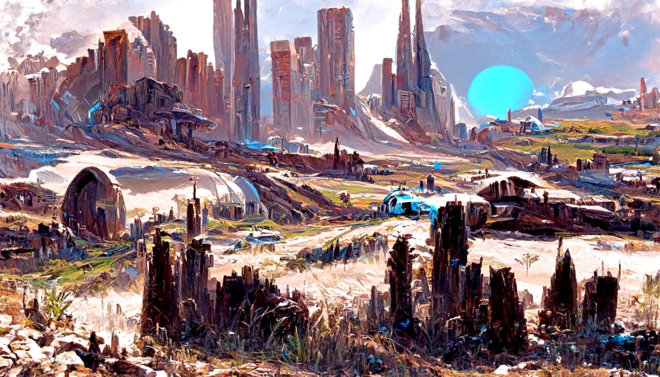
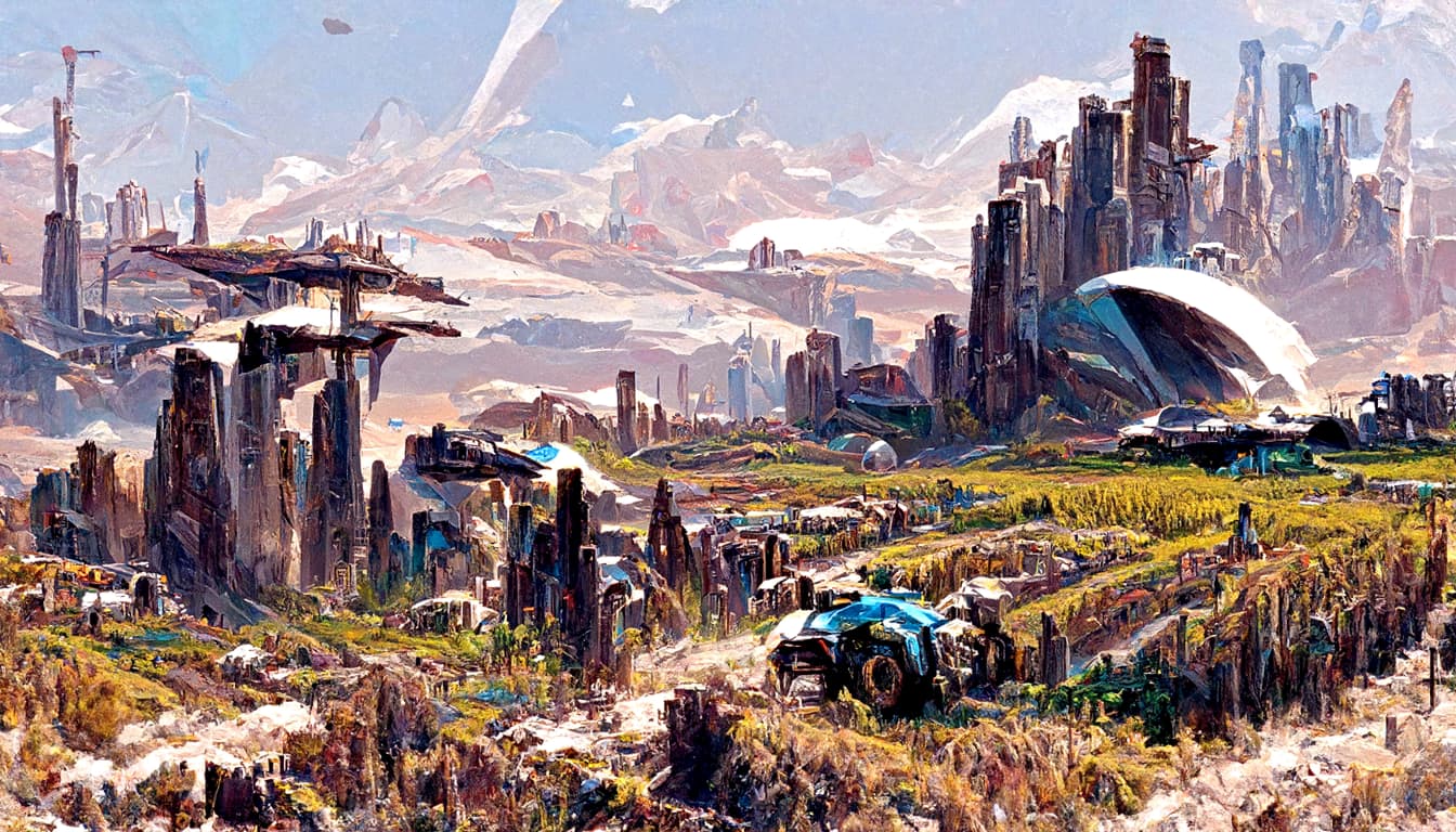
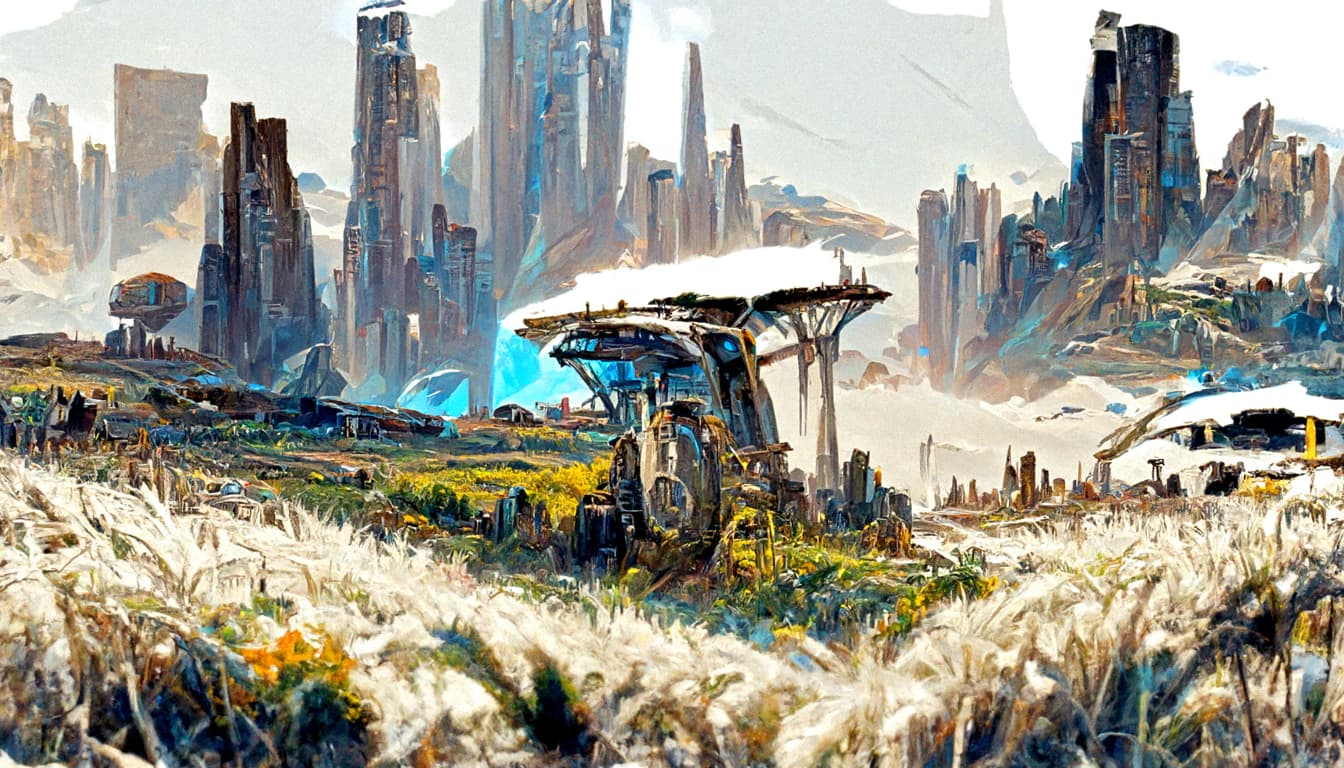
BATCH18 PROMITOR


1 Like
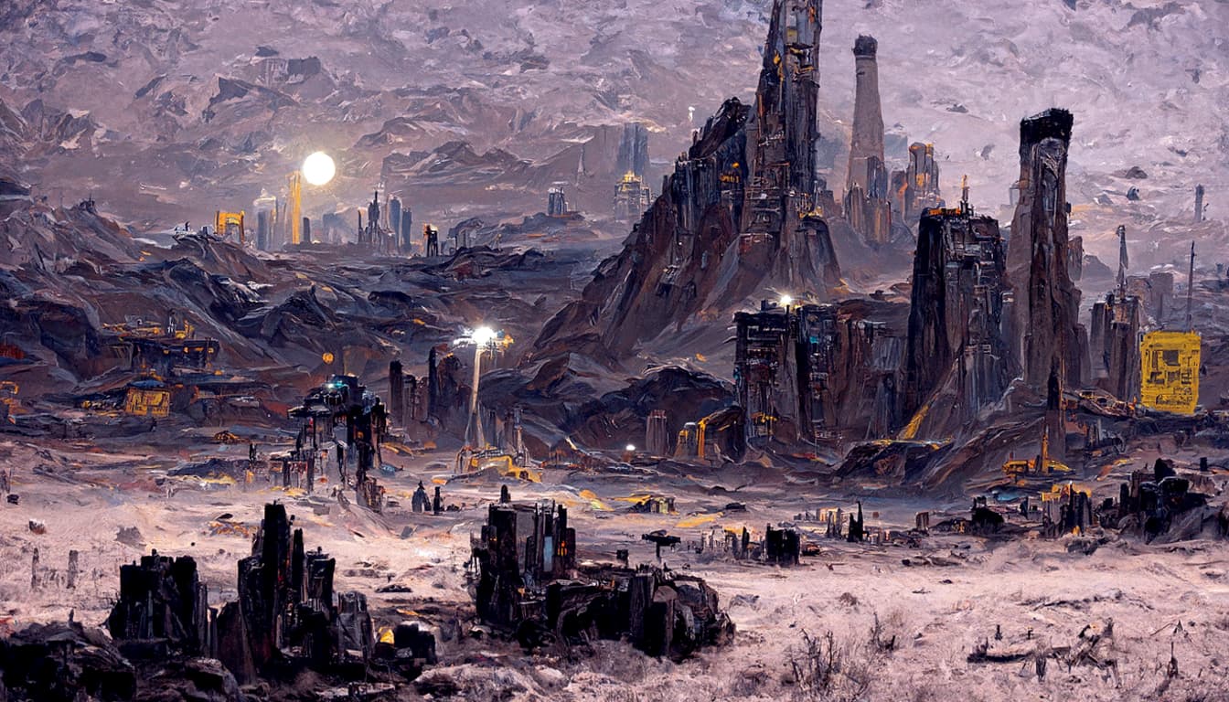
As a first impression, these look great. And I think the different colours from the different minerals and fertility are definitely working well.
Though if you look at each painting for a long time, you start to notice things that don’t make sense. Maybe trying to include cities and machinery is a mistake. Or maybe we haven’t found the right prompt phrases yet.
For Avalon, you could try “A sci-fi painting of a moon’s surface” instead of “planet surface”. That might help to lower the brightness.
Its supposed to be abstract, and its not supposed to be viewed at its full scale. The game is spreadsheets, so expect visuals to be the size of a matchbox too. In this case im not too worried about some minor artifacts, as long as there are no centipede human spider like astronauts. Getting perfect images requires access to Dall-E2 and at this time i dont have it.
Regarding dimming the colors, im afraid its mostly emposed by the selected artists. I will try a few more settings, but mostly its painting bright sky, no matter the prompt nor synthetic settings.
Currently tweaking Boucher and Umbra prompts, as they dont work. Will look into Avalon too.


Im currently struggling with Umbra and Boucher prompts. Most images do not come out as desired. Need to experiment more. Could you write down more details on both worlds?
I really think that the addition of cities is not working. It’s adding little mini cities in the foreground, smaller in absolute size than the larger ones in the background. Plus for Promitor it’s added little skyscrapers in amongst the plants, which is a shame because other parts of those pictures look really good.
Perhaps you could try downweighting the city, machinery, and astronaut components? I think the painting should be mostly scenery, since that’s what makes the planets different from each other. Or the circular noise mask that you suggested could also help, so that it only puts those details in the center, but that’s probably more work.
What’s going wrong with Umbra and Boucher? It’s difficult to add additional details ad hoc, because the string has to be something that we can generate systematically for any planet in the game, in order to create images for thousands of planets. The ones I did for the planets so far are based on their resources and conditions. We can change those mappings if some of them aren’t working, but the general structure of the prompt and the possible variations have to be algorithmic.