I’m less than three weeks in, so I don’t have much to show that’s worth showing, but a thread of this kind will definitely be helpful, I think. Figuring out layout is a minigame in itself.
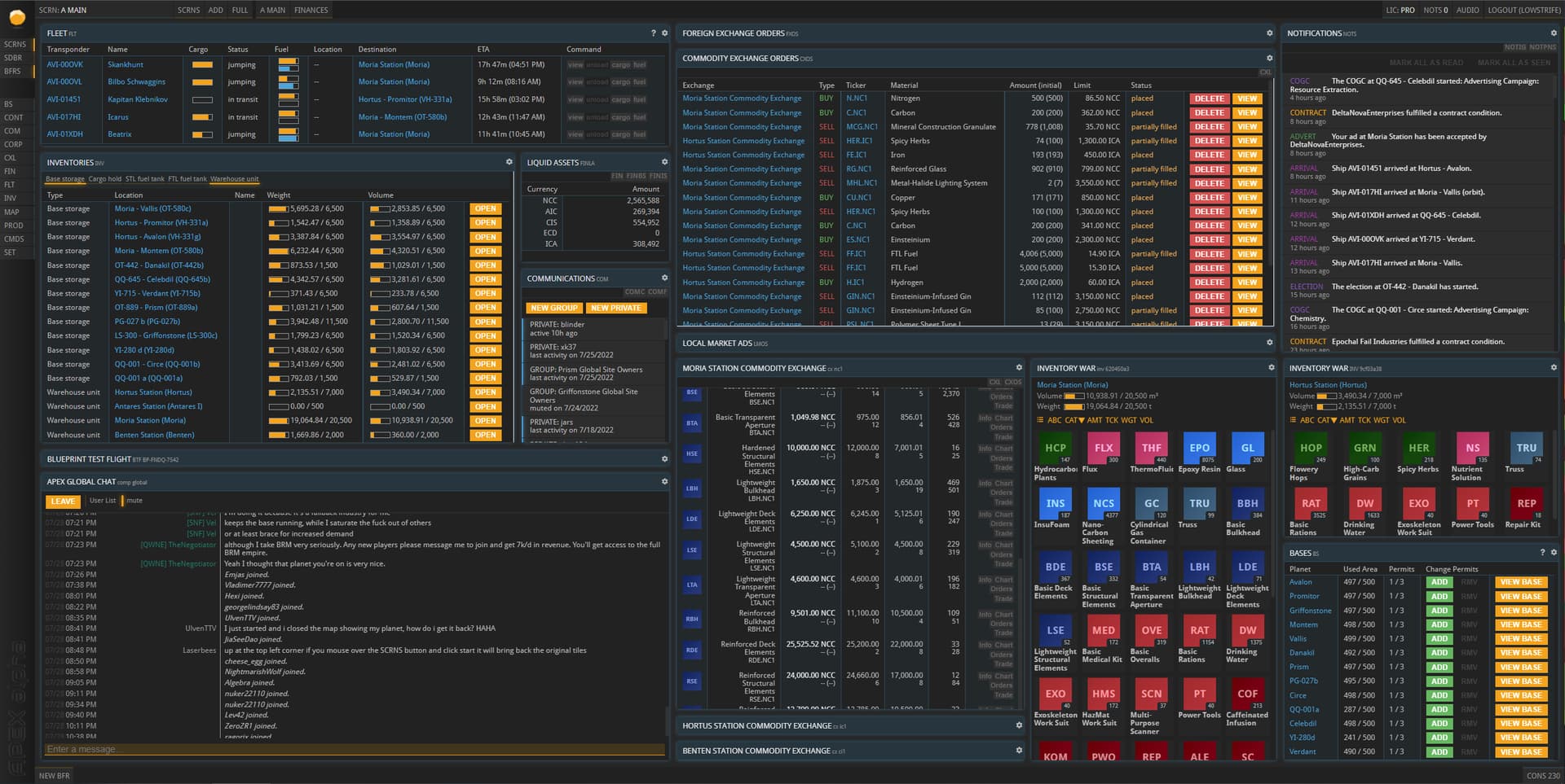
I only use one screen. I operate everything from within this.
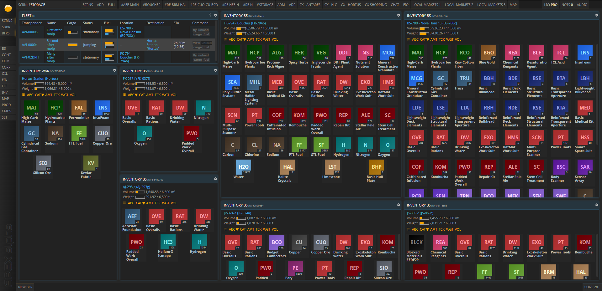
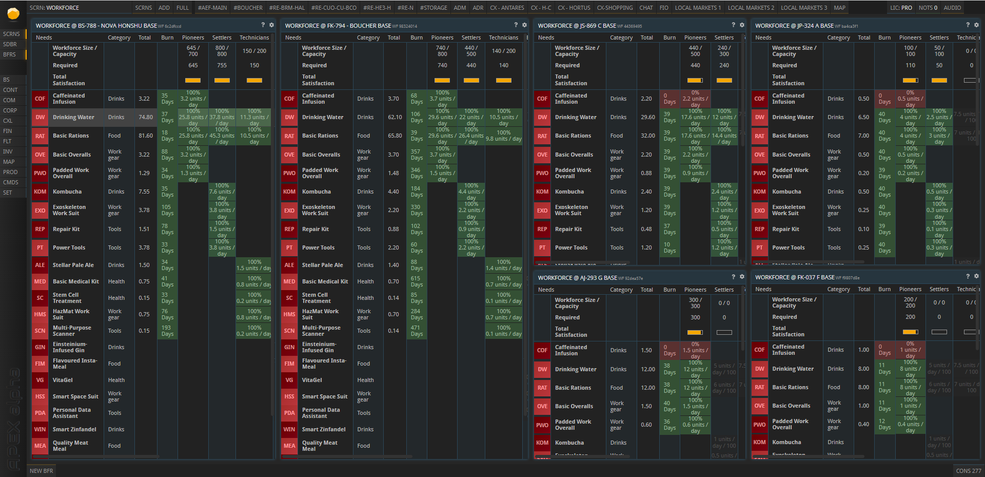
Common theme here is there are many “hidden panels”. Where multiple items are stacked behind each other for items I use all the time and don’t want to open up a new buffer all the time with. All you have to do is slide it up!
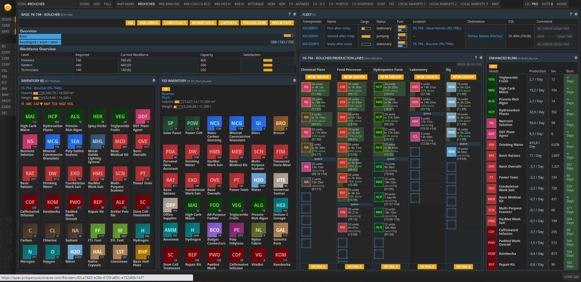
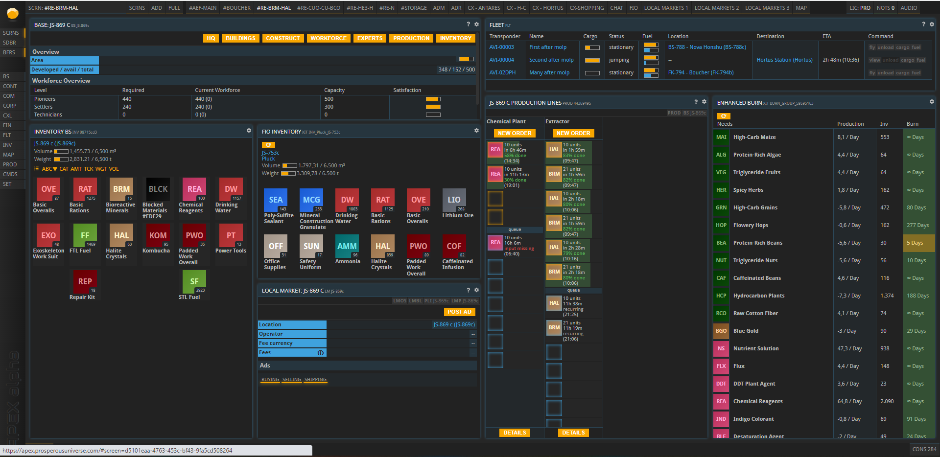
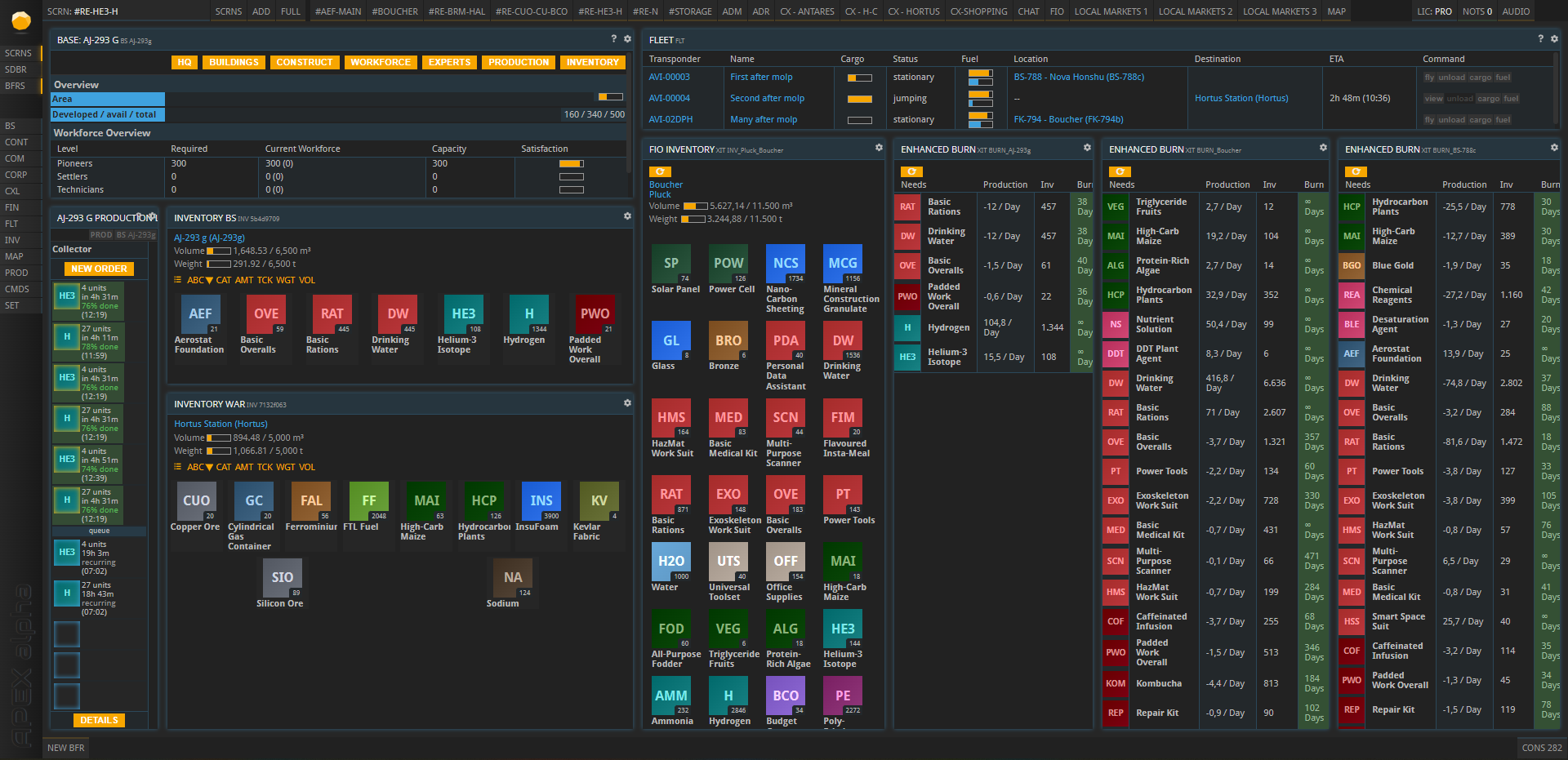
The main goal here is to have global chat, my fleet of ships, my inventories, my orders on the CX anc contracts and FX orders, along with BS which allows me access to any base (like their production window or experts) with one click.
90% of the day-to-day items you need to do are accessible form these pages without opening any new buffers. And it scales up very readily for additional bases you build, I have 13 and each additional base doesn’t take up that much more space.
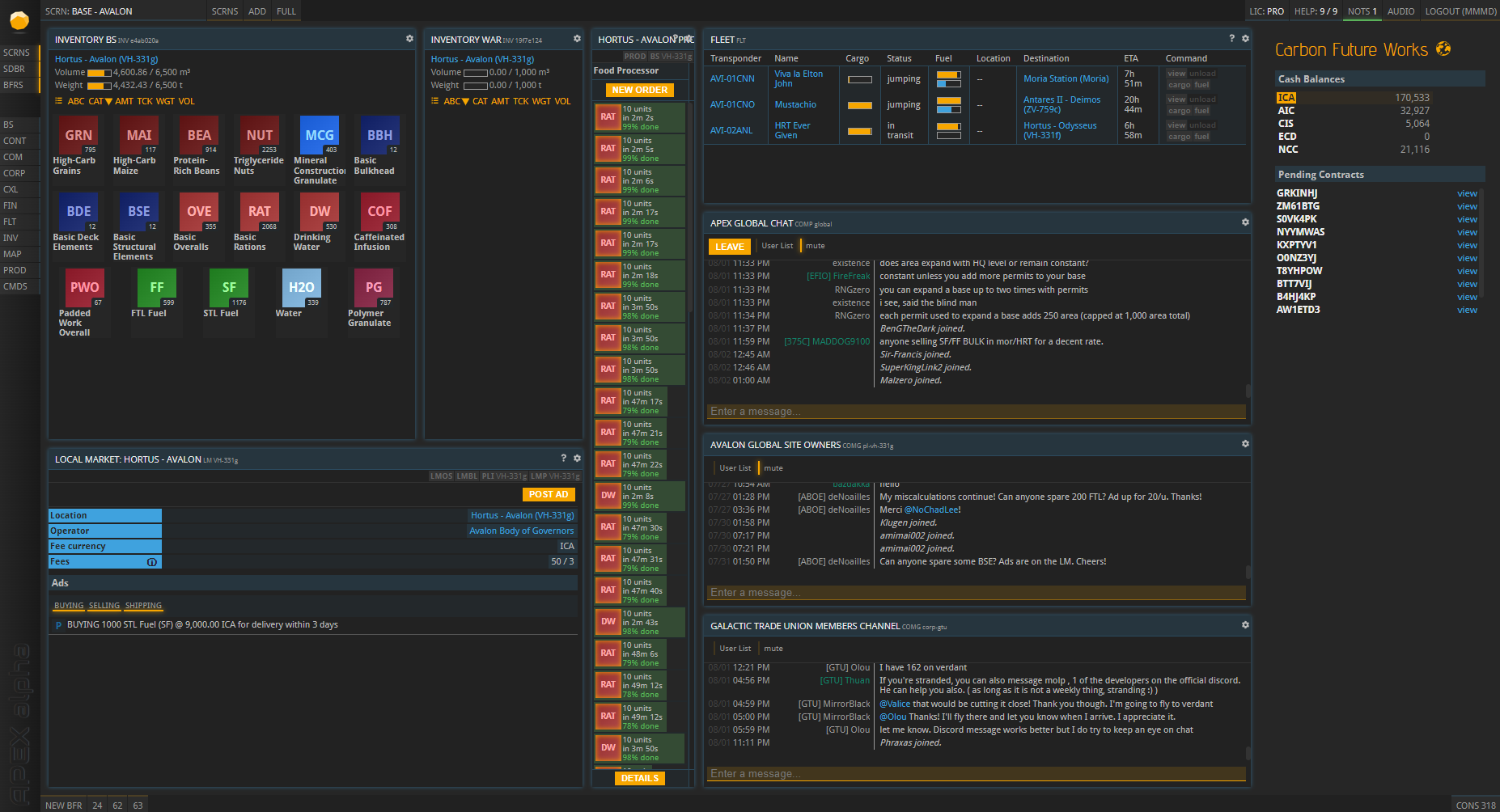
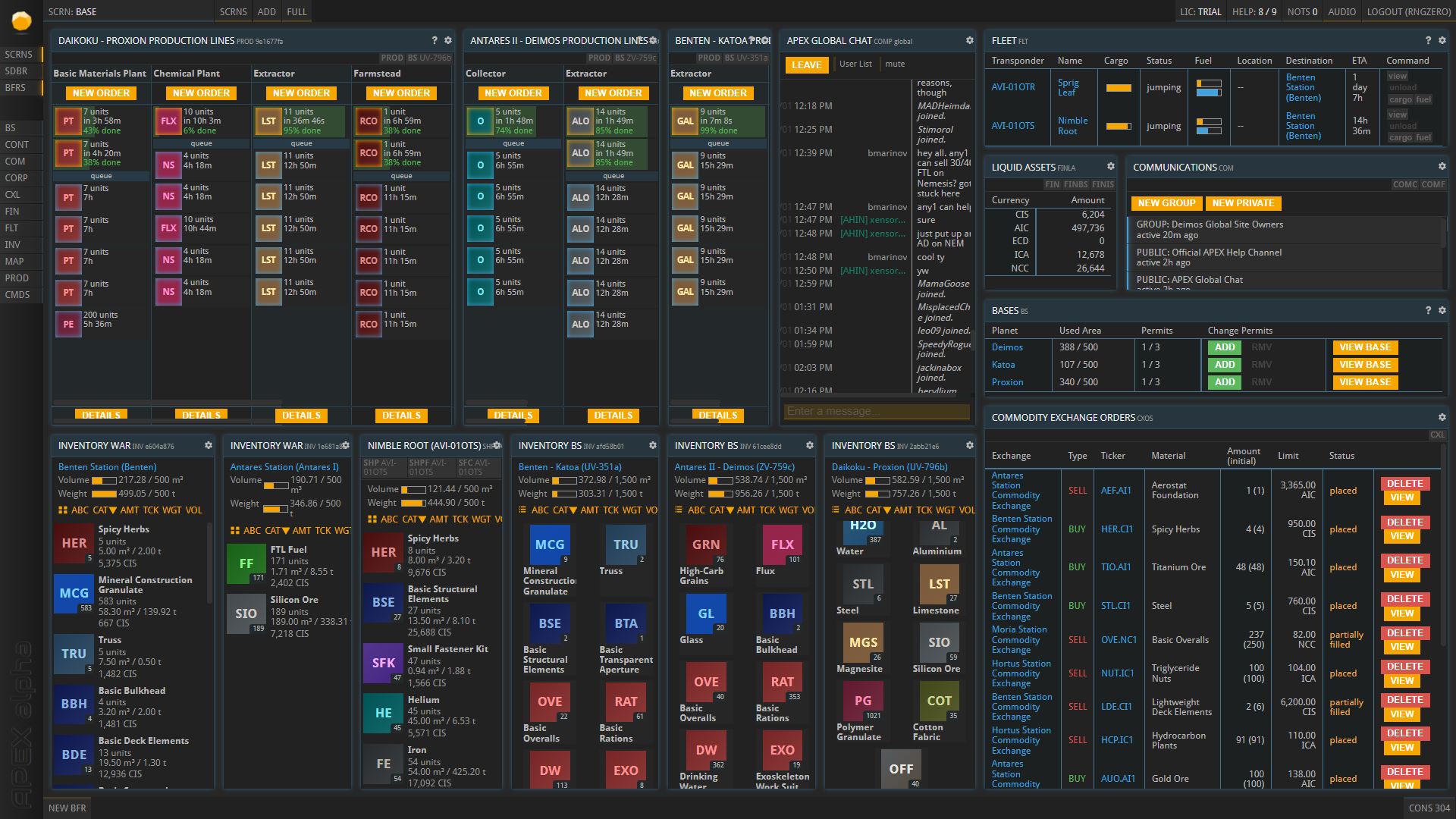
I have basically 2 screen layouts one for bases and one for CX. Plus some others for special tasks, but those two are my main ones. I sometimes switch bas screens around a little depending on how much interaction the production needs.
Hi @Gladi099 - what are the “ENHANCE BURN” buffers? The command you’re using looks like XIT which is not recognised for me. I am also using PMMG Extended.
they are from PMMG Extended and you need to add your FIO username and API key from FIO to the extension settings. jump on the PCT discord and we can help you with that.
@Gladi099 I have done that and PMMG Extended is working (for example in CONTS I have the extra detail) but there are some clear differences with what I see on your screen.
It also doesn’t look like there’s an update available
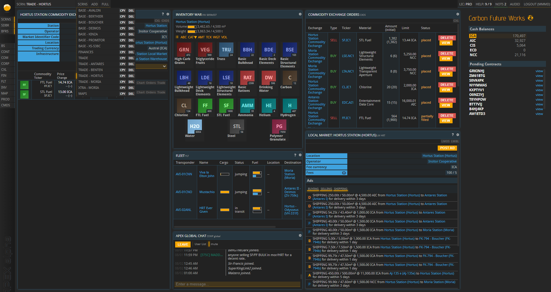
Most of all I like the price comparison window between CX. Simple, beautiful and informative. It took a lot of experimentation to come up with this view. There are now 15 tabs like this