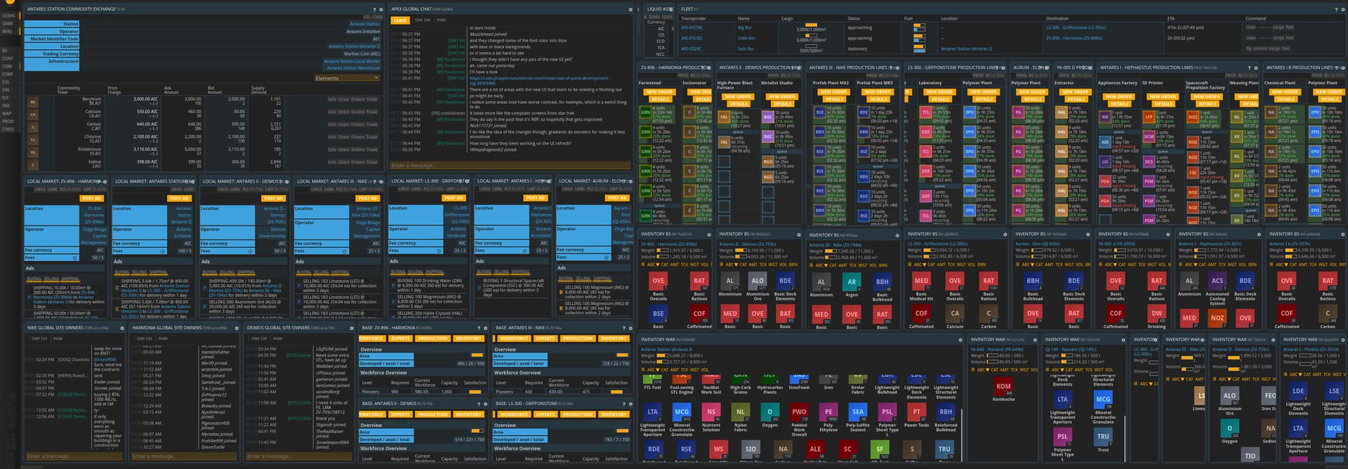
Take a look at some work-in-progress screens of the new UI refresh!
You can find the full issue of the development log here: link
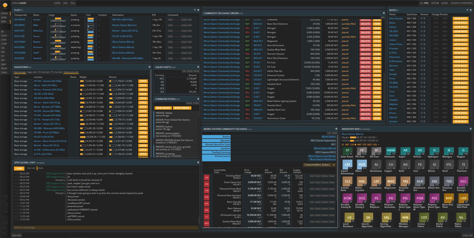
Take a look at some work-in-progress screens of the new UI refresh!
You can find the full issue of the development log here: link
It might be due to the early state of the rework but the contrast of text and its background is pretty low in some cases (e.g. blue text in the PLI but also the buttons at the top of each buffer that open other buffers).
Might be a little early for that kind of feedback, it was just something I noticed right away.
Honestly, judging by the screens, I prefer the older design. It’s mainly about the color scheme. In the older design the colors are more quiet, less flashy. I particularly dislike the flashy lemon yellow. I prefer the old amber yellow. On top of that, as mentioned in the previous comment, the new design has contrast issues with the shades of blue.
One thing I don’t like: The new font sizes are huge, especially on the title of each buffer. I measured the pixels on the header of the INV buffer ad it uses 8.5% more space (291 vs 268 pixels). This means that I will be able to fit less buffers onto my screen and it will be less functional than the old design.
One thing I do like: The new “borderless” approach for buffers with square edges.
I think it’s a far more modern style in line with current design languages.
The color choices other people mentioned are fine for me - but IMO, it’s too “bright”. The color is fine, just turn down the saturation a bit and maybe add a bit more gray back in.
Yes, exactly. It’s about the saturation. Such saturated colors will tire my eyes.
I also feel like the changes are going to take up more screen space. The buffer headers are huge. I manage all of my bases from a single screen on an ultrawide, it’s very compact.
Everyone always hates new designs and says they prefer what they are used to, so I wouldn’t worry about comments along those lines. Also, the reason the lemon yellow clashes is because some of the old amber yellow elements are still present, but presumably they’ll be converted too, so the end result will look fine.
However, I think a couple of the more practical concerns raised are worth looking at:
Normally I wouldn’t recommend this sort of thing, but if the new user experience benefits from having larger titles, and a less dense interface in general, then you might want to consider starting everyone in “Regular” mode, and having an “Advanced” mode available, which makes everything look more like a Linux terminal, with a single small font size, buffer commands instead of titles, and small bunched up buttons instead of nicely padded and spaced ones, etc.
On the other hand, if those are all just CSS changes, then I expect someone in the community will create a set of overrides to achieve that exact thing. So maybe don’t worry about that either.
Would love if there would be an option to choose UI from multiple ones, is there possibility or too much hassle?