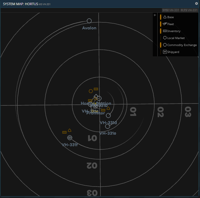
I’ve noticed a couple of bugs with the map - mine has stopped showing highlights for faction, resource etc, all systems are simply white dots.
Also, if I open the map in a buffer on a screen that is currently displaying Local Markets, the Buying/Selling/Shipping list clears and doesn’t reload unless I switch to a different screen and back or reload the page.
Hey, thanks for the bug report. We are aware of the two issues and I’ve prepared a fix for first one (missing resource, population and faction highlights). I hope I will be able to release that fix tomorrow.
The Local Market issue is in our trackers. I cannot give an estimate at the moment when this will be fixed.
The orbits aren’t very clear. I do like the way they fade out - that’s a neat way of showing the direction of the orbit - but I think it would be clearer if they didn’t fade out all the way to nothing. So you could still see the full orbit in a gray colour, and then the “fade out” effect went from white to gray, rather than currently going from gray to nothing.
Also, the orbit lines are fainter than the “grid” lines - the circles showing 01, 02, 03. Are these grid circles really important at all? In the old style maps they were much fainter, but now they are more visible than the orbits themselves, which seems to be the wrong way around. I would make the grid lines fainter again, so that the white/gray orbit lines stand out against them.
Hopefully these are simple colour changes, so wouldn’t require much development or testing time to implement if you decided to do it, but I think they would improve the system map legibility a lot.
I think you bring up a good point. I would agree with fading out the grid circles\crosshairs on the chart to make them less prominent and make the planetary orbits easiest to read.
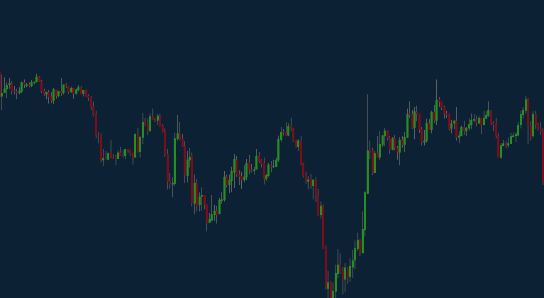
In my day job, I look at price charts all the time. And I have a very subtle grid included on them; but it’s the opposite of the in-your-face approach that’s often used.
It’s subtle, they’re there, but it doesn’t distract from the primary purpose.