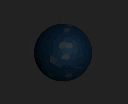
This is what could be most generously described as “boring”. Prosperous Universe could do better to make planets more appealing.
My Solution
Replace the 3D model of the planet with a 2D Image.
Commission a library of planet images, and re-use these for various planets depending on the planet parameters. For example a fertile planet could pick from a library of 5 “earth-like” planet images, a gas giant could pick from a small library of gas giant images, and a planet with high temperature could pick from a small library of lava worlds.
Commission unique illustrations for the starter worlds, and certain named worlds - for example, Promitor, Montem, Katoa, Etherwind, Prism, Verdant, Umbra etc.
What could this look like?
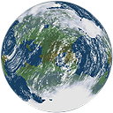
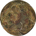
Planets like Promitor or Etherwind:
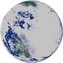
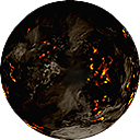
Cold planet
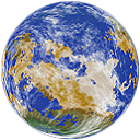
Hot Planet
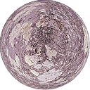
Non-fertile planets like Prism or Umbra
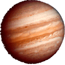
Gas Giant
Disclaimer: I do not own the rights to any of these images.
Why 2D?
3D assets are more expensive and time consuming to create, and generally lower quality. I am not opposed to 3D, I just know from experience that well done illustrations can be much prettier and the benefit of “going 3D” is basically non-existent.
3D Alternatives
There are options out there including asset packs that can be purchased economically such as this:
That being said, I assume it would be difficult to integrate assets like this into a browser game like Prosperous Universe. Getting the shaders, textures, and everything else working in WebGL would likely require a lot of development time. This is why I suggested 2D options.
What about plots?
These can be hidden from the user, or alternatively removed from the game entirely. This is not a feature that I think adds anything to the game, and in many cases it subtracts. Plots would make little sense if the planet has surface features, as one would not be able to build a base on a plot that is in the ocean, at the polar ice caps, etc.
My suggestion has been to have some kind of ‘wrap’ on the planet. So a 2d artwork is wrapped around the object. A cloud layer could be wrapped around this and spin separately. They’d only load at a certain zoom perhaps.
My dream would be that the system could differentiate between at first GG’s and Rocky planets. But could perhaps have a few different basic artwork renders, with then a couple different cloud renders. Such that with only a few different pieces a large variety could be made. I’m sure things like Ice-caps, or atmospheric thickness could be relatively easily accounted for by turning the planet data into a set for the opacity or such of certain additional layers.
Katoa with it’s low water concentration but fertility would take the ‘Arid Fertile’ land render and then have the ‘Ammonia Cloud’ top layer. To create a somewhat unique one, that would be different to the Promitor ‘Wet Fertile’ land and ‘Oxygen Cloud’.
If i was to then dream further, a perk available for purchase would be to have the contracted artist make a special render for your planet of choice, which would help flesh out the planet options even further.
I don’t know how complicated this would be from a programming side of course. But it sounds plausible to me… It would take artwork though that would certainly cost
molp’s current map developments do look really great though.
There is free software and tools floating around that can generate planet surface images to wrap around a sphere.
The problems I see are that
it may not be consistent with the styling of the rest of apex, and
we’ll have players complaining or posting that “my plot is entirely in the ocean, but I have land hurr durr”, or “my plot is in lava roflcopter”.
Though it would be awesome to have surface images, I doubt molp has the time to write a generator that would then also map plots to “land only” areas, or introduce special material requirements based on the location of the plot when compared to the surface image.
There was a colorful backdrop, colorful stars and we even had textured planets in the system maps. We quickly realized that that isn’t the style we wanted. Two reasons:
We have a background in web development, not 3d programming / art. At the time we didn’t feel like we could live up to the expectations the modern players have with our limited experience
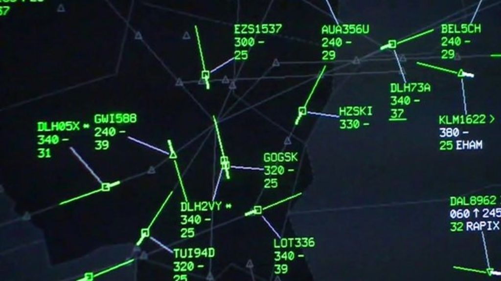
We draw heavy inspiration from professional tools like ATC (Air Traffic Controls) and Bloomberg (a trading terminal). Here is an example:
The traffic controller does not care for how the planes look or the terrain below, they are interested in course, speed and height and the UI reflects that.
That is why we decided to ditch the windowed system you see above and implement APEX. A professional tool, so to speak ;), to manage a company in the far future. This is also the reason why we want to keep the maps abstract.
I don’t want to rule out changes to the maps in the future, but I think realistic looking planet maps are not the right direction for us.