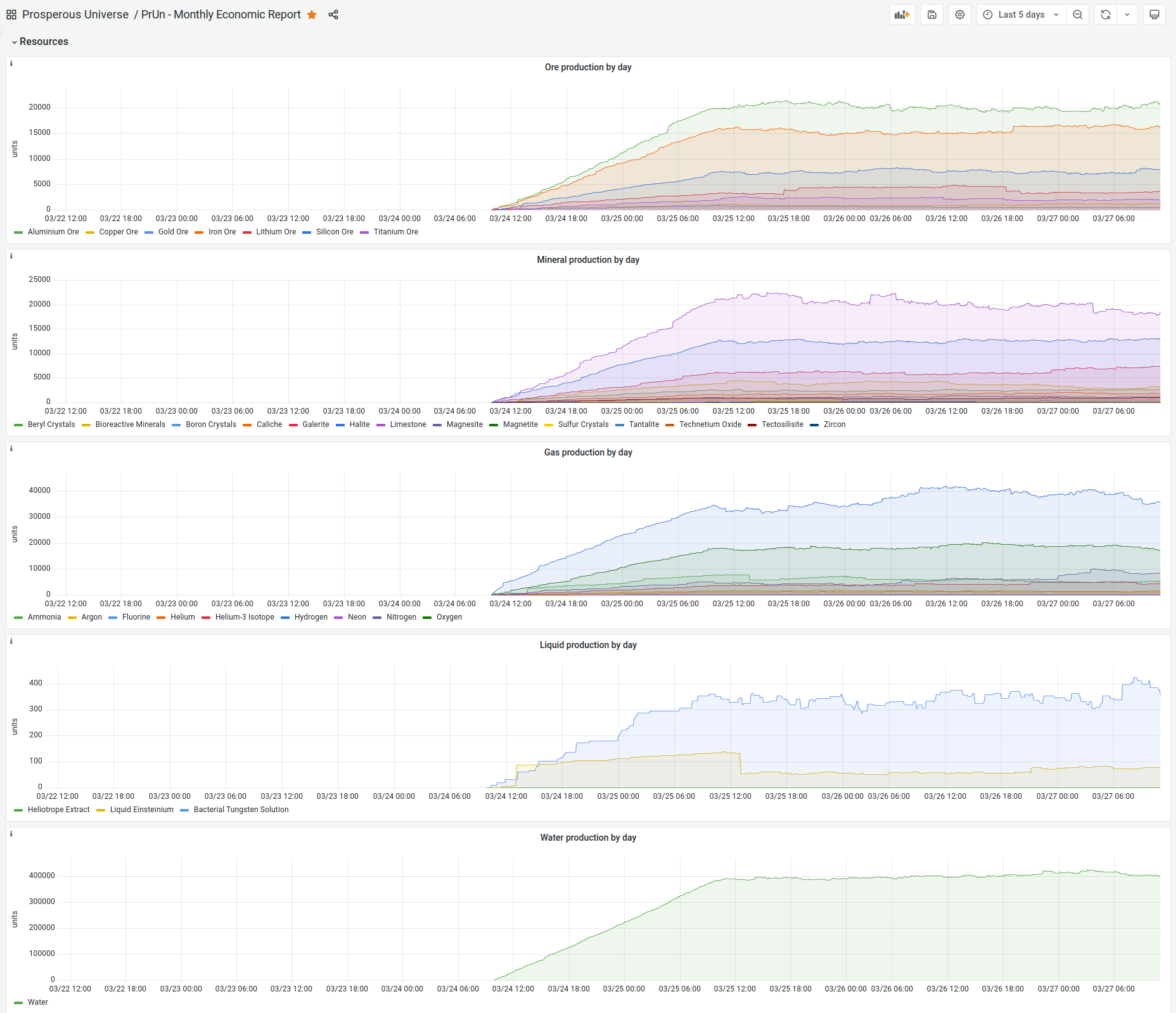
It’s been over a year (wow!) since we last got any insight into the overall level of activity in the PrUn economy beyond what can be deduced from the publicly-available data. What I think would be super-interesting to know at this stage (where posts like this bemoan the supposed death of public trading) is how much volume (quantity, not price) of each product has been produced by all players in the past week? Breaking it down by the faction affiliation of the producing player would be amazing too, but even a whole-universe summary would allow the community to entertain itself for hours discussing the health of the economy!
We really love the idea of sharing economic data in a monthly report, but we don’t have the resources to do it as a in-game feature at the moment. Instead, we could utilize the internal tools we have to generate a report. It could look like this for example:
What that be something you’d be interested?
3 Likes
![]()
This sort of thing would be amazing. A logarithmic y-axis would be helpful for reading the smaller lines, but this would already provide some fascinating insight.
Is this a rolling sum (15,000 ALO produced between 09:15 one day and 09:15 the next?
Yes, based on the previous 24 hours.
That is certainly a valid option. I haven’t thought about that yet. My current solution is to split the resources into multiple graphs, one with high volume and one with low volume resources (see the water/liquid example above)
I think a weekly or even monthly breakdown of these charts would be a perfectly suitable stop gap. No need to integrate directly into the game. Can just have a quick data dump once a month of these charts. We can parse over it or something. Can easily implement with minimal work.
I can help & go over the charting to figure out what is best to publicly release, in the most useful format. I deal with charts quite a lot don’t ya know ;).
1 Like
I love it! If the data is accessible, I’m sure there will be plenty of players who will plot it in many different ways. So I think it would be great to have this in whatever form is easiest for the dev team!
Wow, it’s great to see these collection charts. Quite a few resource categories are split between high volume and low collection rates.
Quite interesting that ALO is collected more then FEO.
I’ve had some time to think about this. I’ve come to an interesting conclusion… I think that charts might not be the most useful metric if we’re being honest. The lines will for the most part be flat, as at this stage I think the economy is pretty stable and there aren’t dramatic changes happening. Additionally, it will be impossible with layered charts like this to determine how much of low-volume goods is being produced.
So I think honestly, just a text box is better. Weekly, monthly, yearly averages. This includes currency supply\mm inflation as well.
I don’t agree that changes over time aren’t interesting, I think a graph is a useful way of presenting it. I’m already intrigued by that step change in LES production, for instance: did someone tear down a base? But I do agree that being able to read all the numbers, including (in fact especially) for items with low volume, is extremely important.
1 Like