hi,
for the past few days, it seems that the buffer size changes the alignement of what’s in it and now it looks all mixed if the buffer is not wide enough.
e.g. :
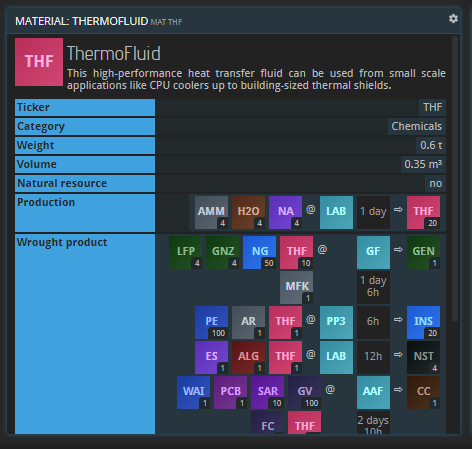
I suggest reducing the size of the light blue column since it is a lot of “wasted” space on all buffers.
or possibly changing it as a header of each categories rather than a side column (making the buffer content a bit longer but a lot less wide).