Hi 
While I quite enjoy the game, the mobile interface is tedious, to say the least.
It has quite a few Idiosyncrasies that I really don’t understand (what’s up with having one window to select Cargo transfer goods type, source inventory and target inventory, and then having an entirely separate window, half of which is taken up by an animation which just displays the same resource icon twice and some flashing arrows, just to select the amount?), something that really bothers me is how the game evidently assumes that while it explicitly has a different interface for mobile, it still assumes that my mobile screen is about 10’’ diagonal.
Lots of windows behave strangely because their width doesnt fit on the mobile screen (trying to drag the fuel amount sliders while sending a ship is a particular pain, because the entire window scrolls due to the route listing table further down being too wide).
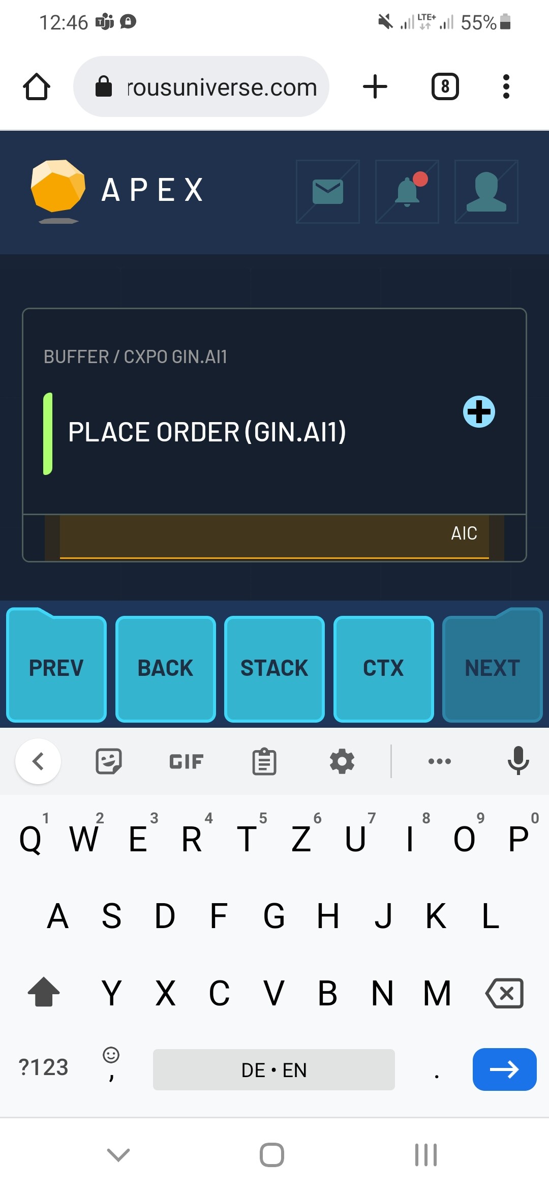
And, most unnecessarily of all, there’s about 50 pixels of padding around everything. Again, this annoys me most when trying to send ships or do anything else that requires keyboard input via mobile: a third of my screen is covered by the keyboard, a fifth is taken up by the top bar and the endless whitespace below it, and another fifth by the card title (which has enough whitespace above and below the large-print title to place another entire title), and then some space also gets taken up by the navigation buttons at the bottom, where I don’t know why they’re even placed in such a way as to be displayed when the keyboard is visible; I’m hardly likely to want to navigate back to the stack while entering other data, and which also has enough whitespace for a line of text above it.
All in all, this means that I have pretty much exactly room for the form element that I’m entering data into (not even its title) in my actual window. And when you’re trying to enter ship coordinates, that means you better hope that the destination you’re looking for is actually the first in the list, or your browser is likely to mess you up while trying to differentiate scrolling in the dropdown list and scrolling in the actual data window.
While I’d appreciate eventual fixes for the odder things such as the first mentioned one about cargo transfers, I’d just like to ask: why all the dead space on an interface designed for small screens? Can we get at least the vertical padding reduced some and maybe navigation buttons at the bottom hidden if the keyboard pops up? Both of those should be doable fixes without much effort and would greatly increase usability.
Plus, maybe some slightly smaller fonts for non-critical information would help.